
Los 50
ART DIRECTION/MOTION GRAPHICS / TOOLKITS / TEMPLATES
Designing a visual facelift
Los 50 returned as a cultural event, not just a reality competition. The challenge was evolving an already successful property without losing the familiarity audiences connected to in the first place. The new season needed to feel bigger, sharper, and more theatrical while still instantly recognizable to returning viewers.
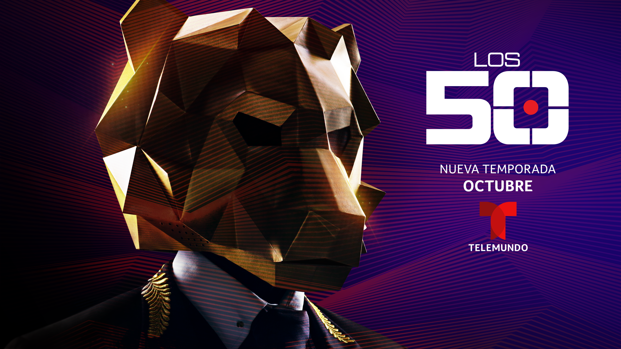
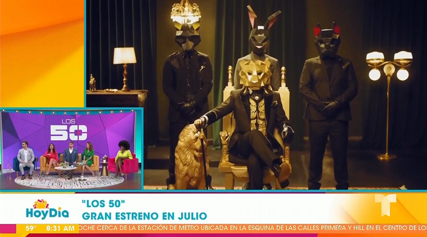
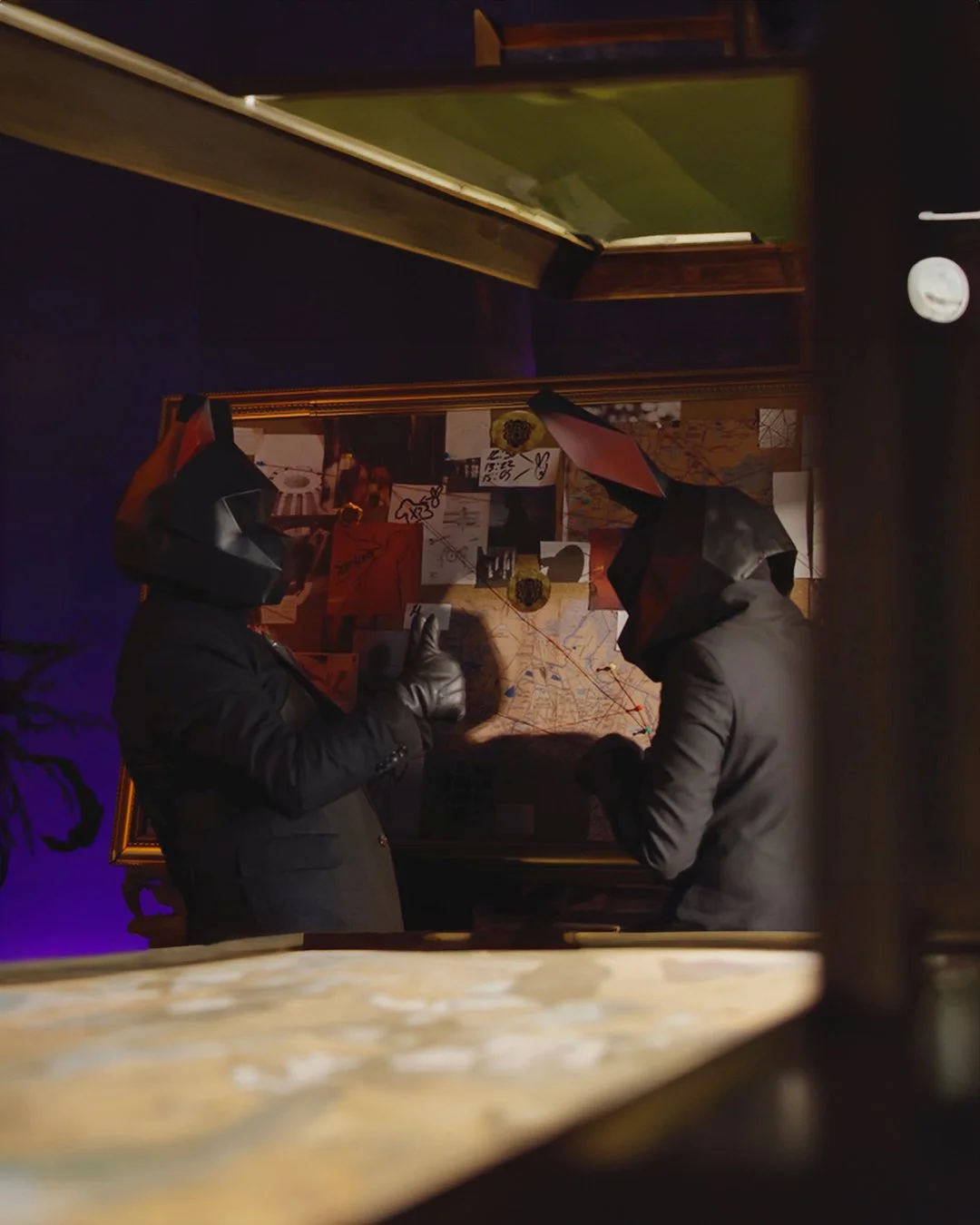
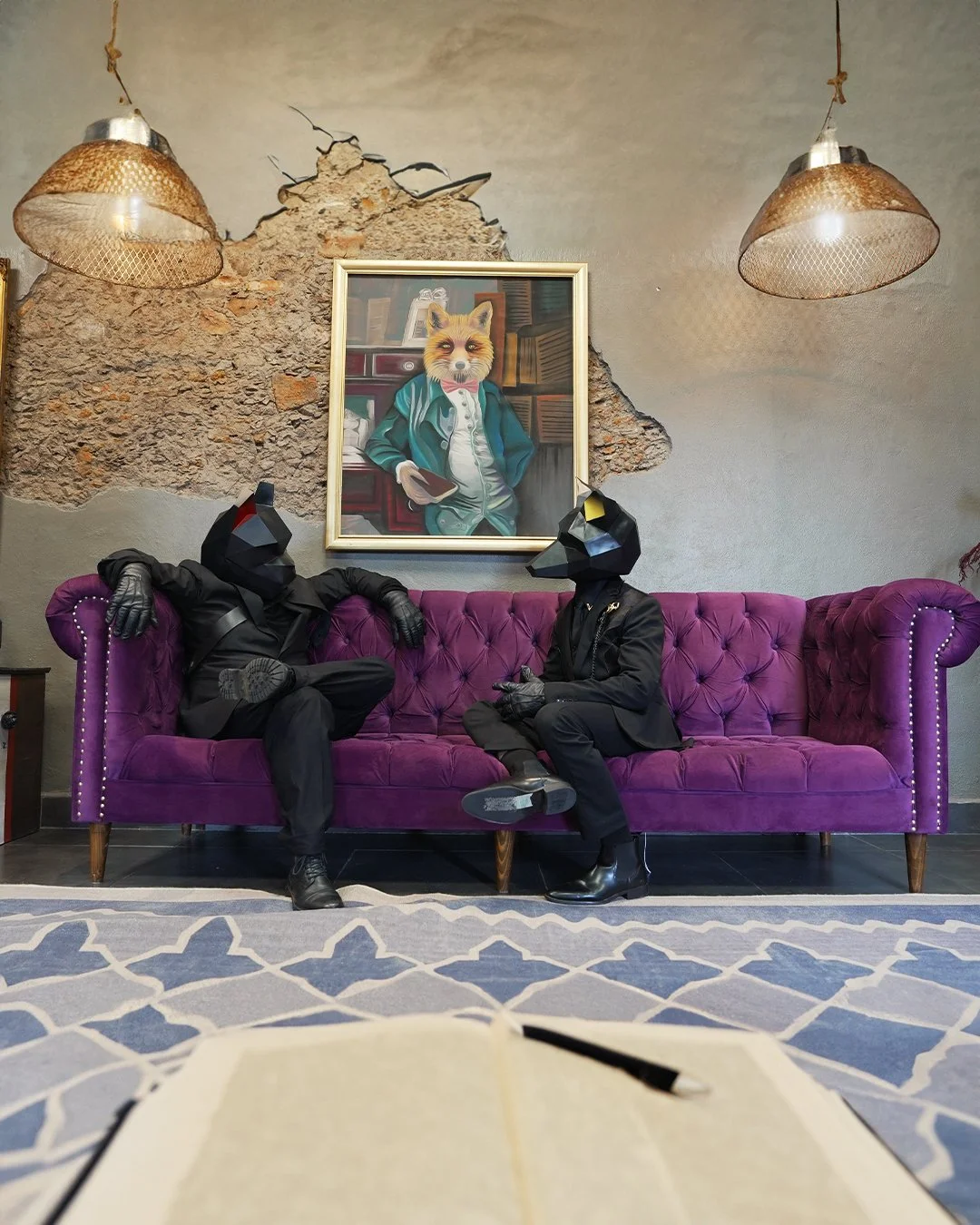
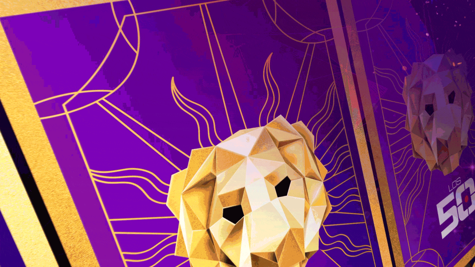
At the center of the concept was El León, a dominant, ever-present force that controlled the game, the chaos, and the players within it. The visual system leaned into scale, tension, and theatricality, positioning Los 50 as a cinematic arena where anything could happen. From the graphic language to motion behavior, every element reinforced a sense of authority, unpredictability, and spectacle.
I led the art direction and motion design across broadcast, social, digital, and experiential touchpoints, building a visual identity flexible enough to evolve across broadcast, social, live experiences, and digital touchpoints without losing its core personality. The result was a cohesive campaign that elevated the property’s identity, supported multi-platform rollout, and reintroduced Los 50 as one of Telemundo’s most visually distinctive and talked-about series.

DATE —
May - Dec 2024
ROLE —
Art Direction, Motion Graphics, Toolkits, Templets
DELIVERABLES —
Design Decks, Art Direction, Logo Design, Motion Graphics, Social Toolkit, Sustaining Elements, OOH, Experiential, Digital.
CHANNELS —
Broadcast, Streaming, Social, Apps, Web, Events
CONSTRAINTS —
Tight Timeline, Brand rules + Network Guidelines, Cross-Team Approvals
OUTCOME —
Delivered on deadline for launch / premiere
Used across multiple platforms [broadcast + Hulu + OneApp]
Expanded into a reusable toolkit / templates
Used for executive / leadership-facing materials
Approved by network leadership
Scaled across multiple deliverables and formats
International / Spanish-first broadcast reach
— TEASER KEYART —
— MAIN KEYART —

[ MOODBOARD ]

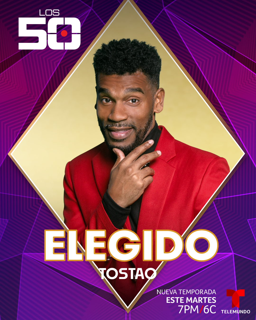
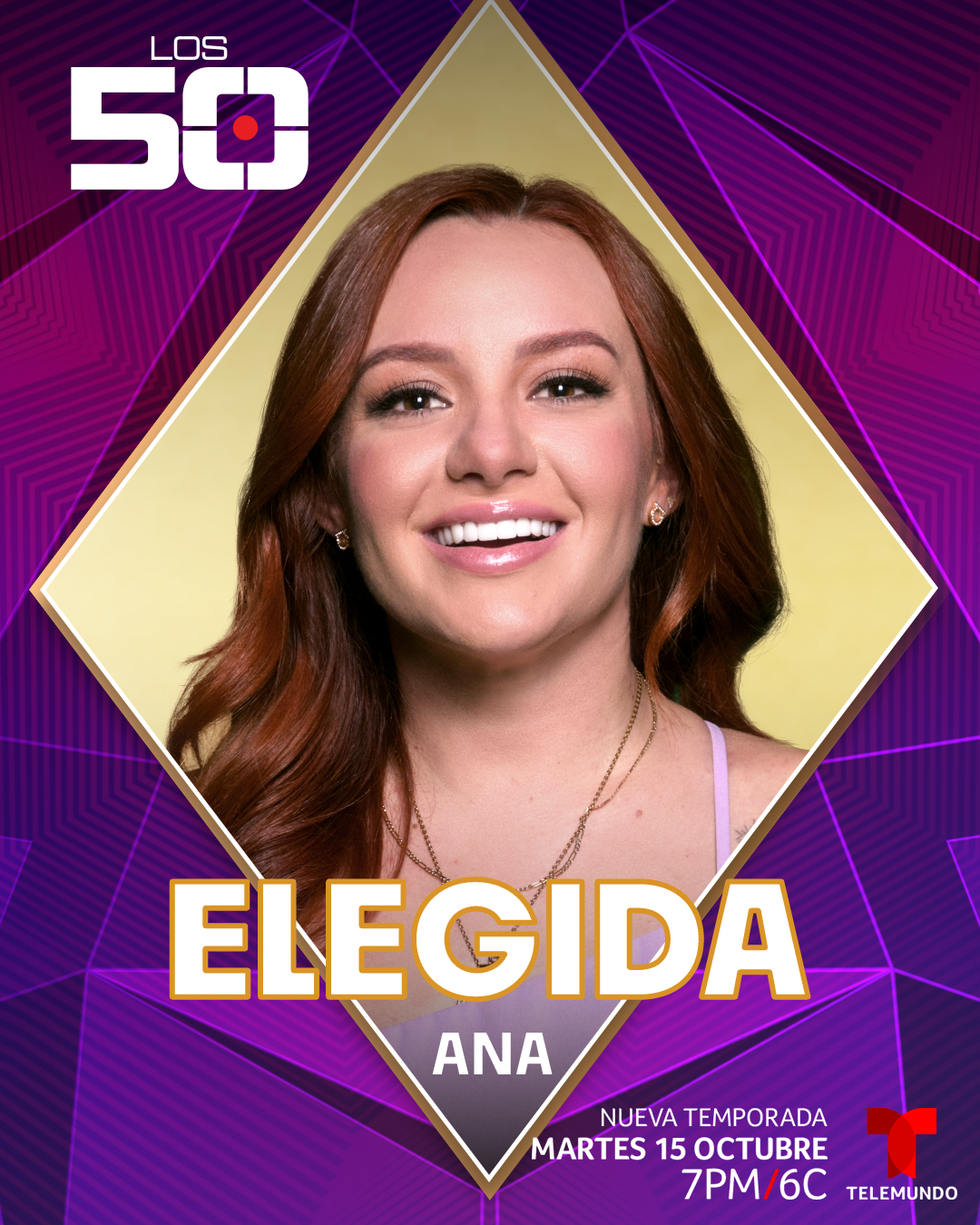
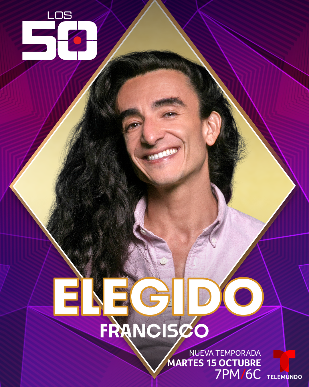
The visual direction balanced familiarity with reinvention. Existing motifs like the lion mask, playing cards, and geometric iconography were refined into a more cinematic and modern visual identity that could scale naturally across social campaigns, broadcast graphics, experiential elements, and promotional assets. Every piece of the system was designed to feel cohesive while still flexible enough to evolve week-to-week alongside the competition itself.


— VISUAL DESIGN SOLUTION —
Lion geometric mask as a kaleidoscope + backdrop for the show and overall design
Audience comprehension + Brand equity
Initially a 3D logo, transitioned into a flat sleek modern design, shedding its bulky and busy visual. This improved comprehension while maintaining the iconic presence.

―
A cohesive design package that plays off familiarity, iconography, and visual comprehension. Elevating this new seasons challenge and bringing a modern design to returning and new viewers alike.

The visual direction needed to match the shows elegance and uniqueness. Using cards that were a symbol of the show to also drive social assets.
— ALL IN THE DETAILS —
Combining design elements, motifs, and colors + Satisfying motion graphics
A visual feast for the eyes and senses that kept viewers coming back

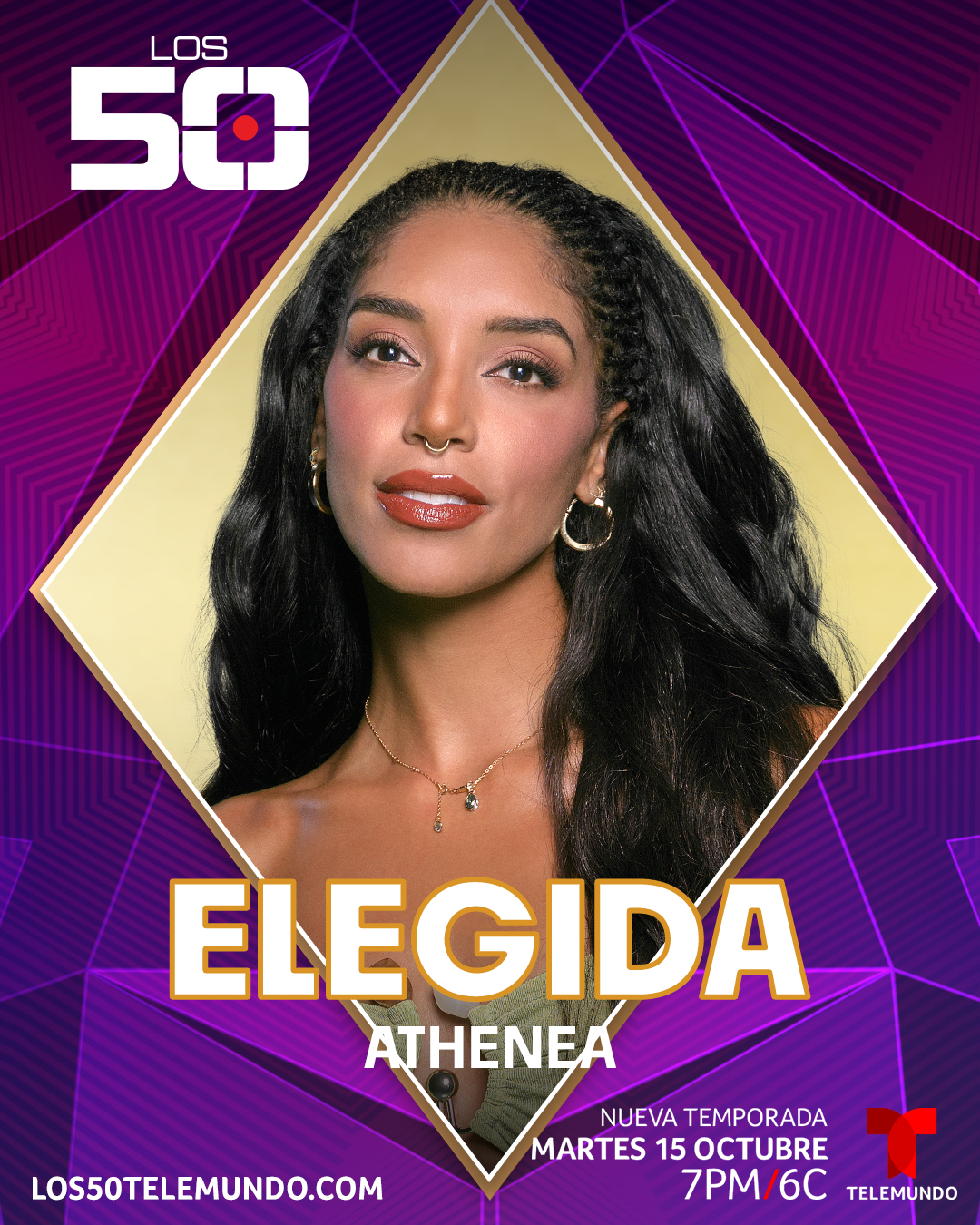
[ SOCIAL ]
Social media phenomenon
—
Platform-specific toolkits for X, YouTube, and campaign-driven social posts.
Twitter / X - Headers
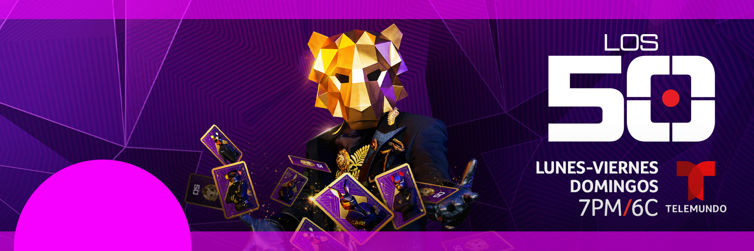
YouTube - Headers
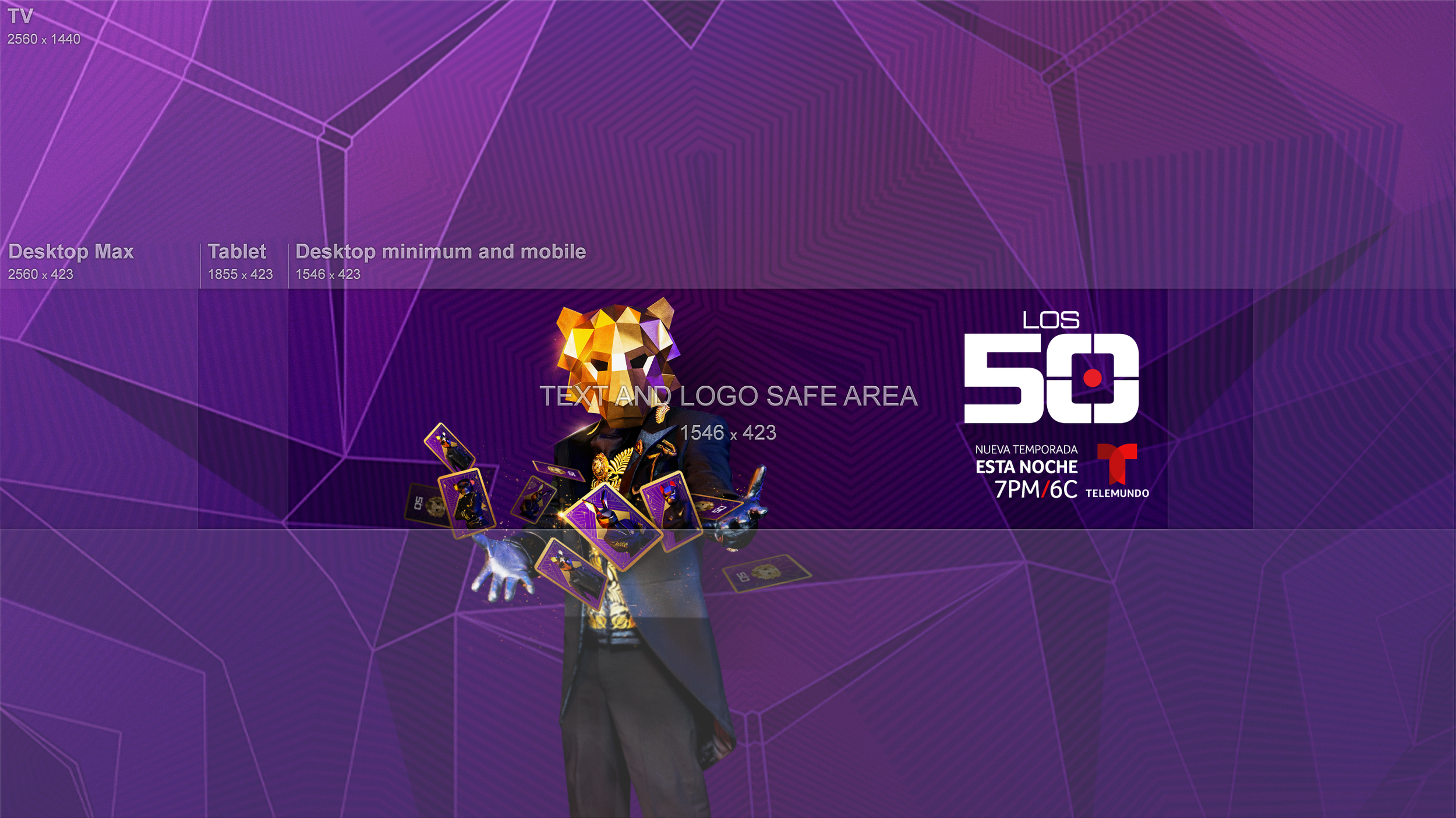
Platform-specific executions
[ OOH’s ]
OOH YEA
Celebrating a new project, talent, and a bold creative look
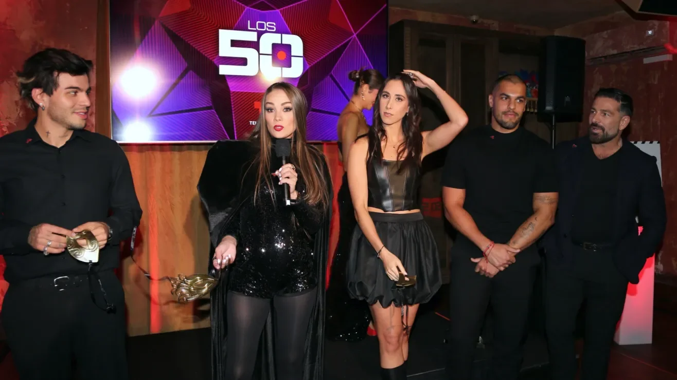
[ EXPERIENTIALS ]
SUIT UP FOR LIGHTS, CAMERA, ACTION!
Designing the wearable details.
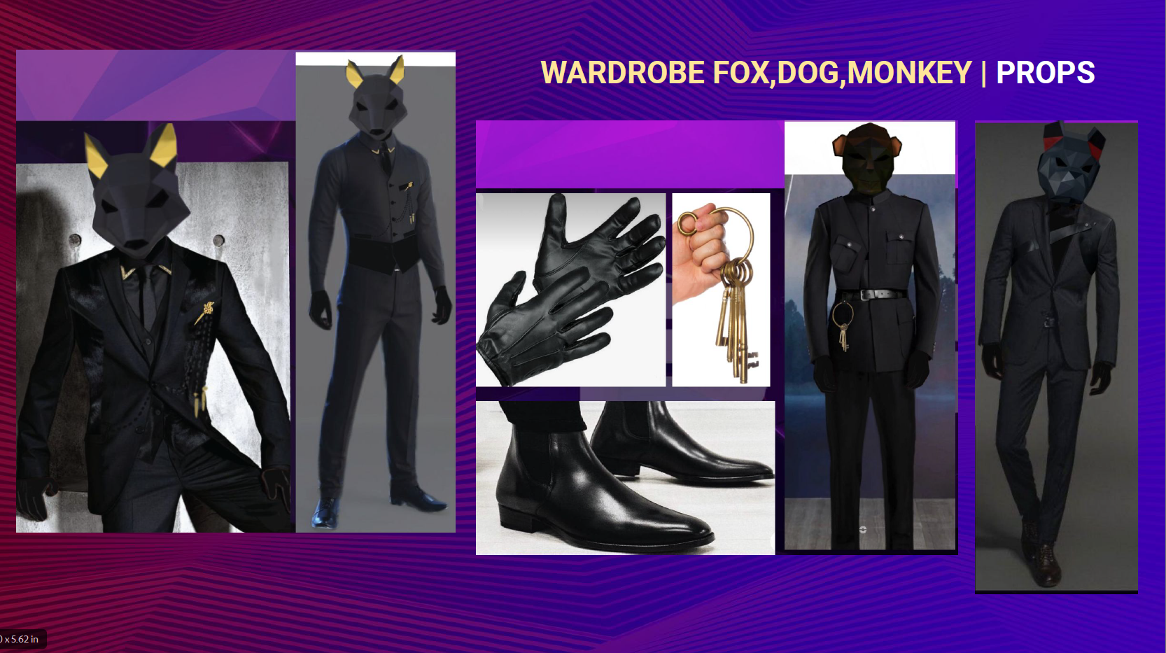
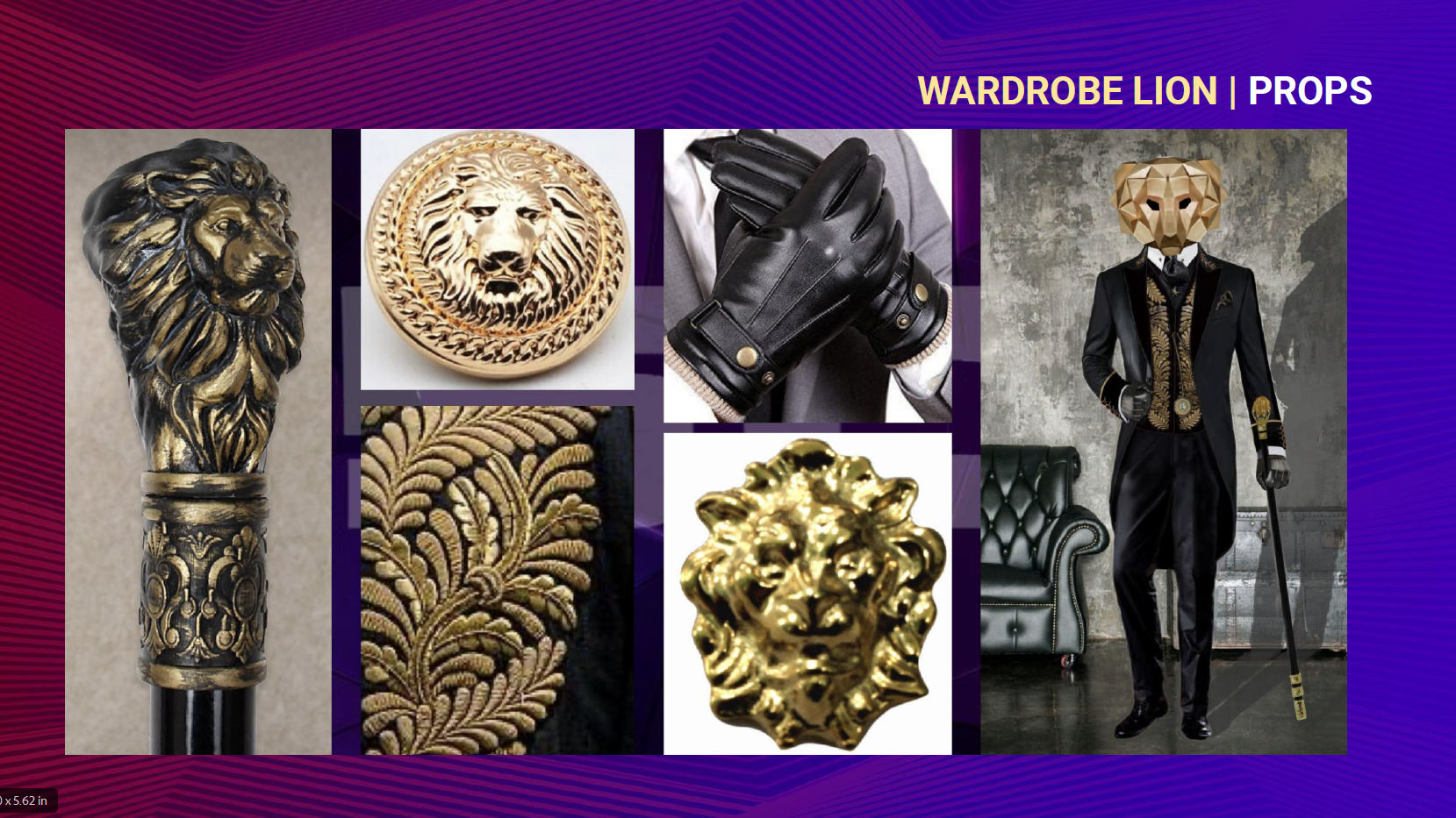
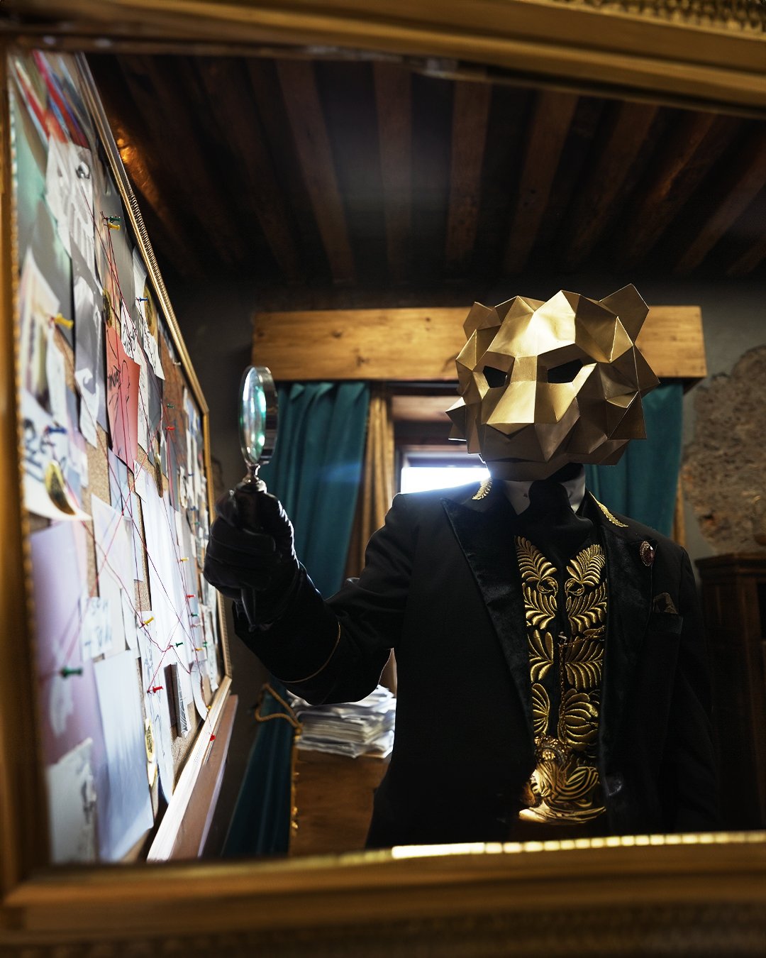
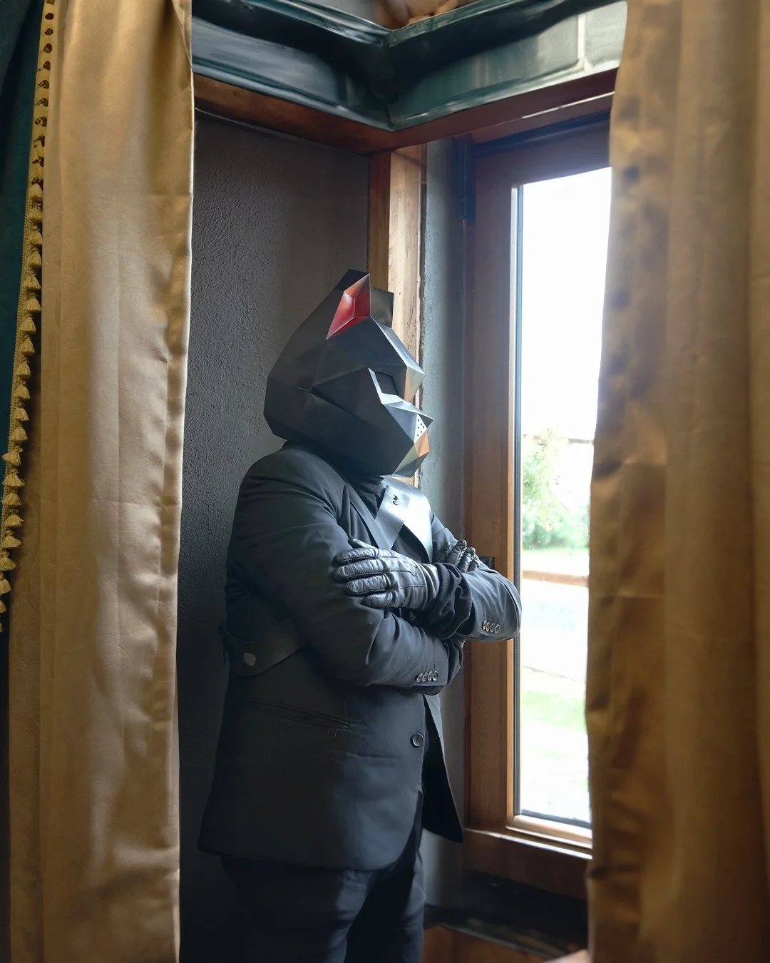
[ THE MASK ]

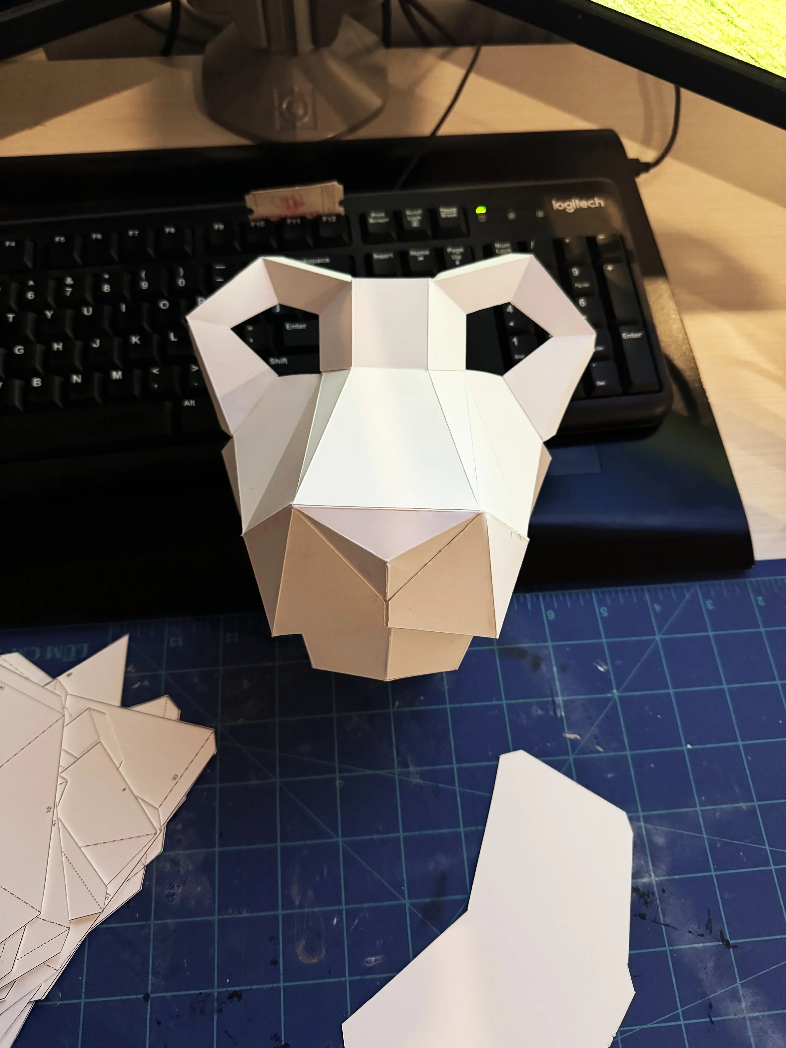

EL LEON MASK
To extend the show beyond the screen, I designed and physically constructed a wearable version of El León’s mask for talent and promotional appearances. The piece became both a visual prop and an immersive brand extension, turning one of the show’s core symbols into something audiences and talent could physically interact with.
“
“The talent on this project is amazing. The mask isn’t just on the screen, it’s in front of me. This is so cool.”
[ CHRIS MOORE • CREATIVE DIRECTOR ]
Internal recognition from creative leadership
