
DINASTIA CASILLAS
BRAND IDENTITY / MOTION GRAPHICS / ART DIRECTION
Keeping it in the family
Dinastía Casillas is a premium serialized drama centered on power, legacy, and generational conflict within one of television’s most formidable families. The creative challenge was to evolve an established franchise into a darker, more cinematic identity that reflected ambition, authority, and consequence while honoring its legacy.
I led visual direction and motion design to develop a cohesive brand system that translated the world of the Casillas family into a bold, high-impact visual language across broadcast and promotional touchpoints.
DATE —
July - January 2026
ROLE —
Art Direction, Motion Graphics, Toolkits, Digital Templets, Social Elements
DELIVERABLES —
Design Decks, Logo Design, Motion Language, Social Toolkit, Promo Graphics, Sustaining Broadcast Elements, Event Assets.
CHANNELS —
Broadcast, Digital, OOH, Experiential, Promotional.
CONSTRAINTS —
Tight Timeline, Brand rules + Network Guidelines, Cross-Team Approvals.
OUTCOME —
Delivered on deadline for launch / premiere
Supported long-form storytelling with a flexible visual system adaptable to multiple episodes and release windows
Rolled out as the visual system across the full season, spanning weekly episodes, promos, and launch materials
Maintained brand continuity while signaling a bold creative evolution for the Casillas franchise
Elevated the franchise’s visual identity with a darker, more cinematic tone that reinforced themes of power, legacy, and authority
Experimented with AI workflow
Approved and implemented in collaboration with marketing and production teams
[ THE BIG IDEA ]
A visual identity built around legacy and control, where typography, motion, and pacing reinforce the weight of power and the cost of ambition.
Every design decision was guided by the idea that power is not loud, it is deliberate, measured, and immovable.
— RUNNING THE FAMILY BUSINESS —
The visual system favored contrast and restraint, ensuring that the brand felt premium, grounded, and confident rather than ornamental.
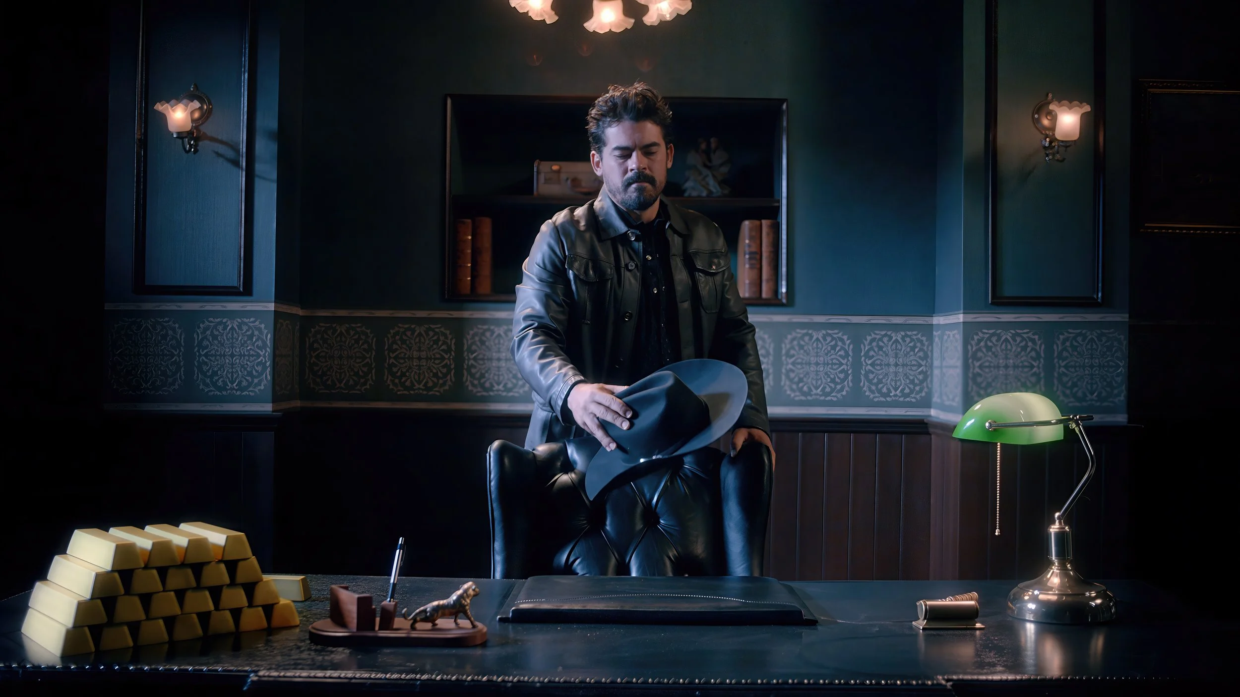
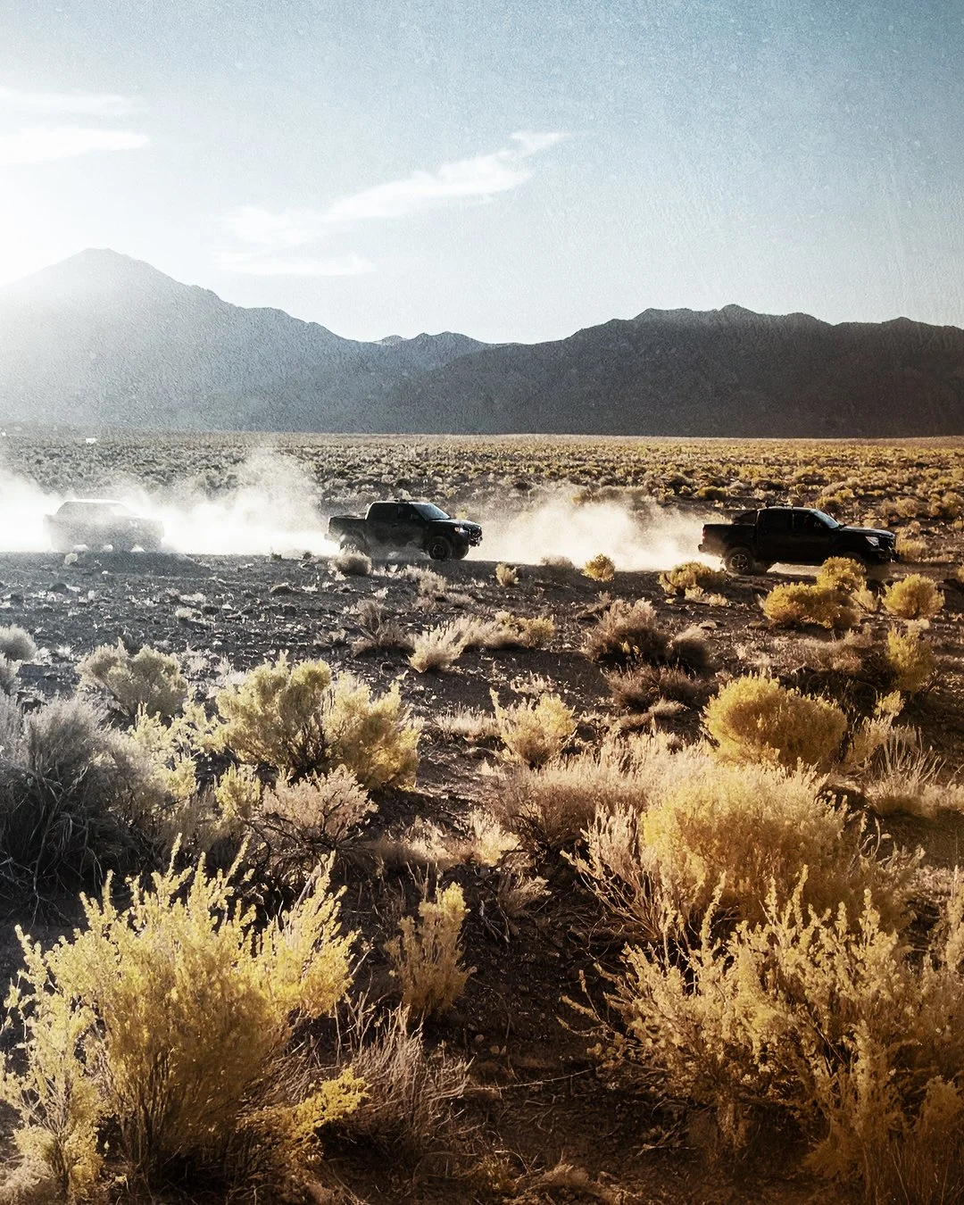
The Casillas family empire was crumbling in the wake of Aurelio’s apparent death.
With enemies encroaching on the family business and friends turning into foes, showing that danger was in every corner was priority.
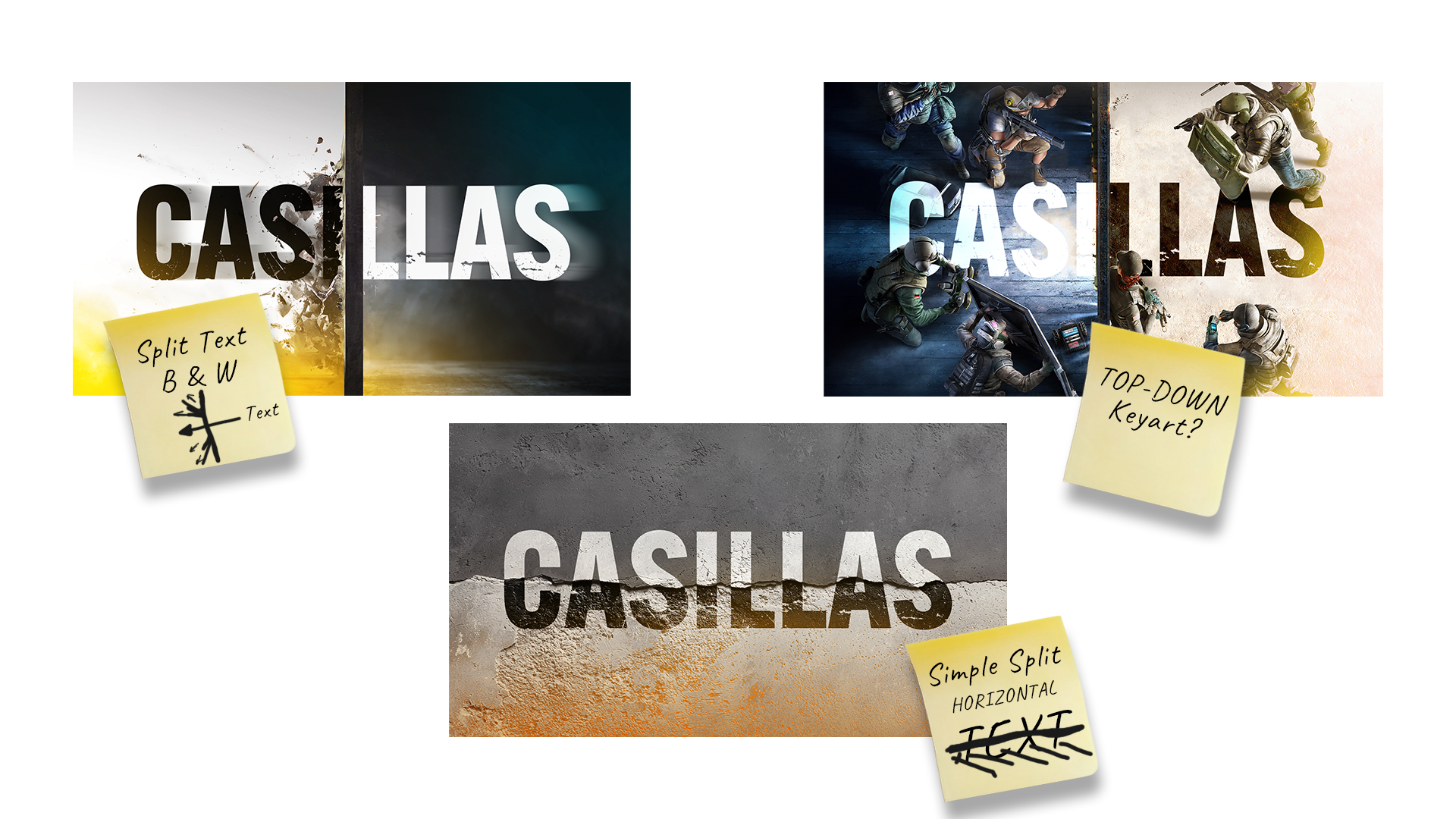
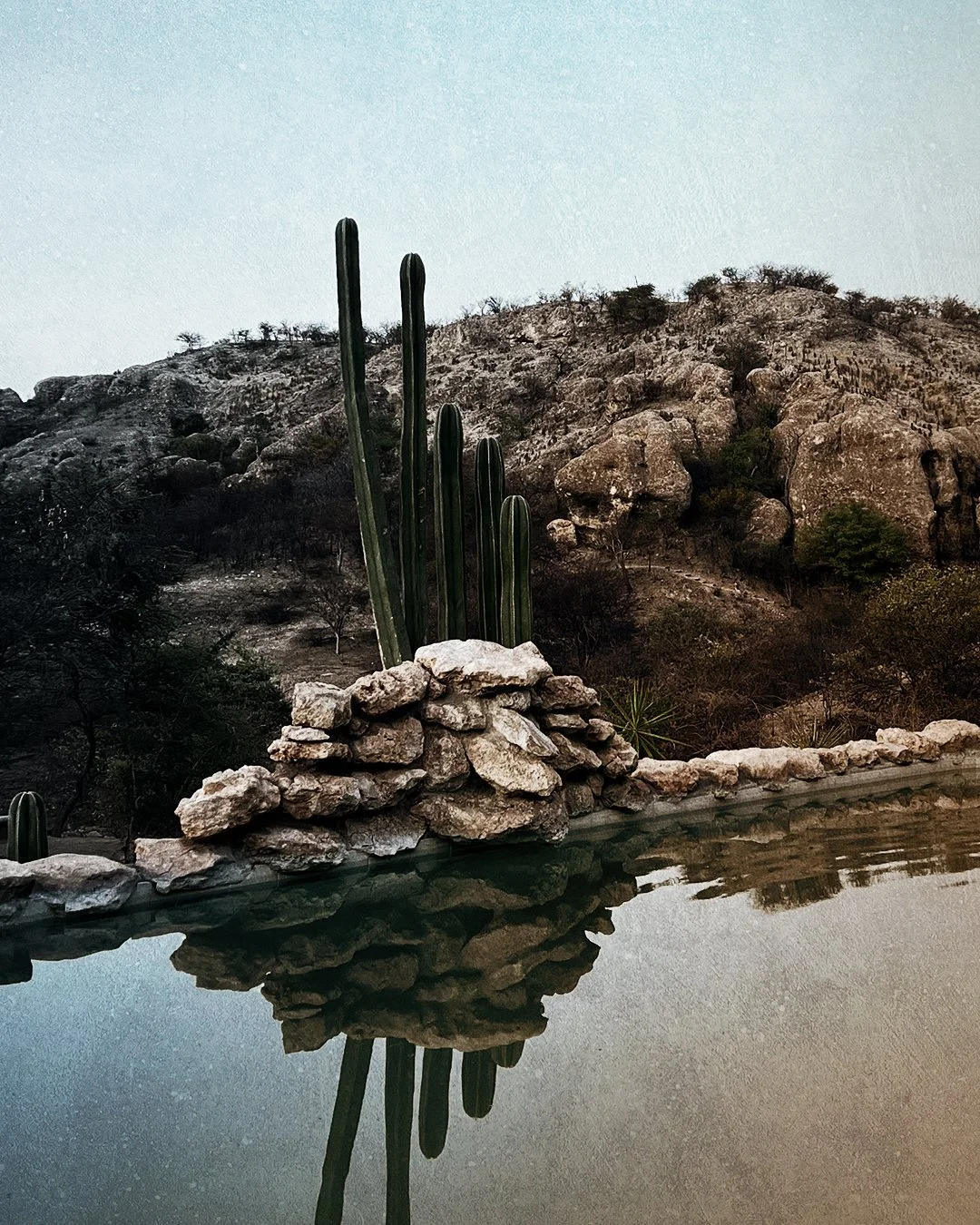
[ VISUAL DESIGN SYSTEM ]
Breaking down barriers
—
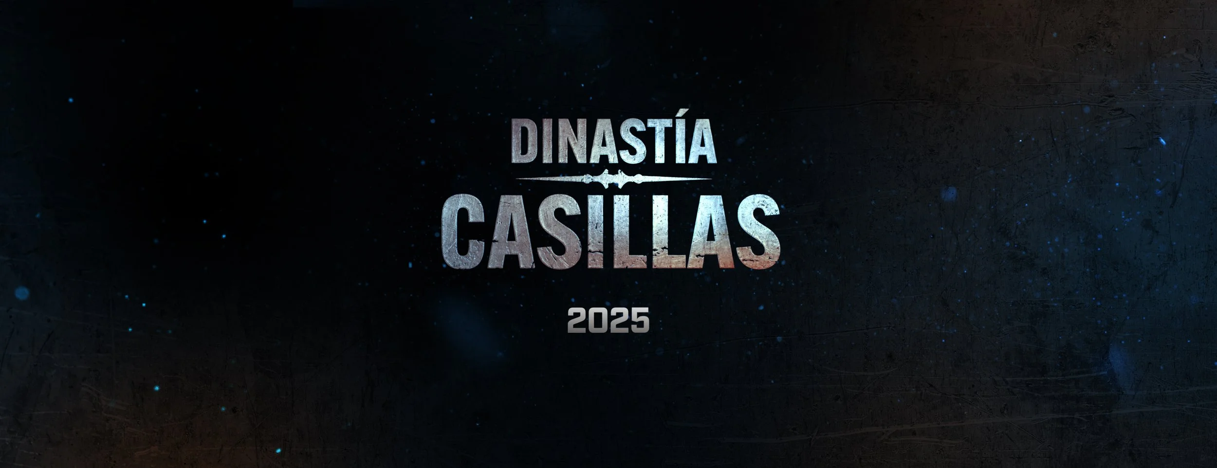
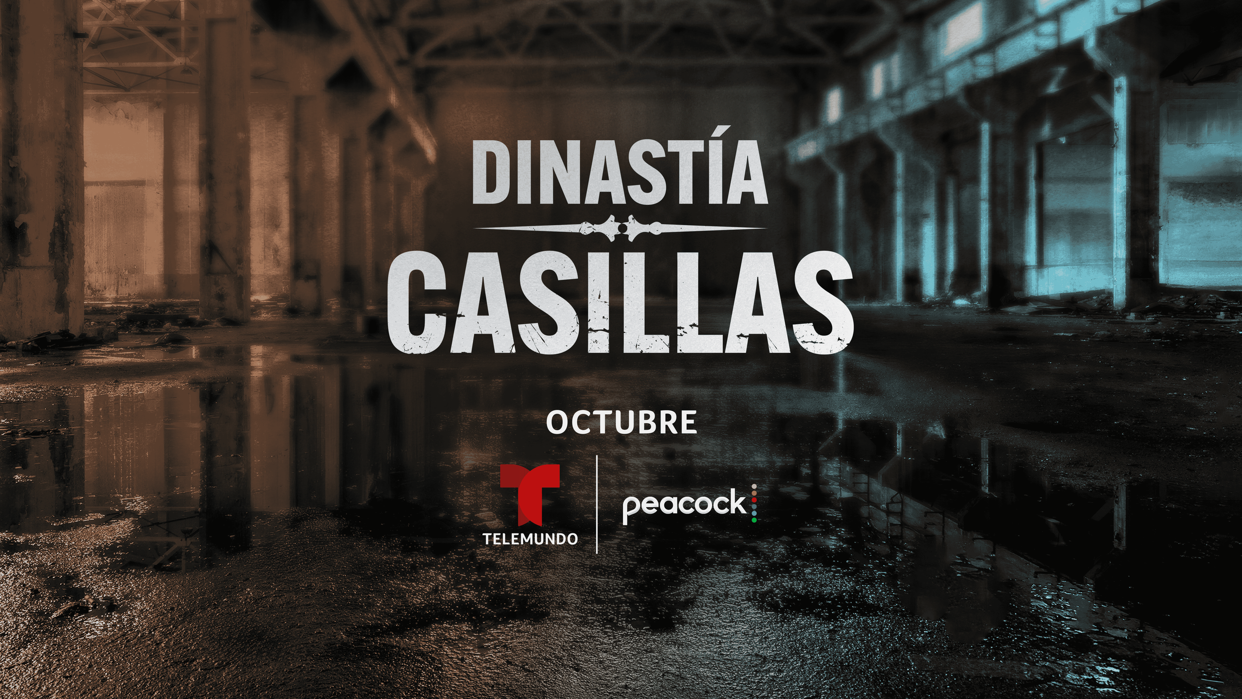
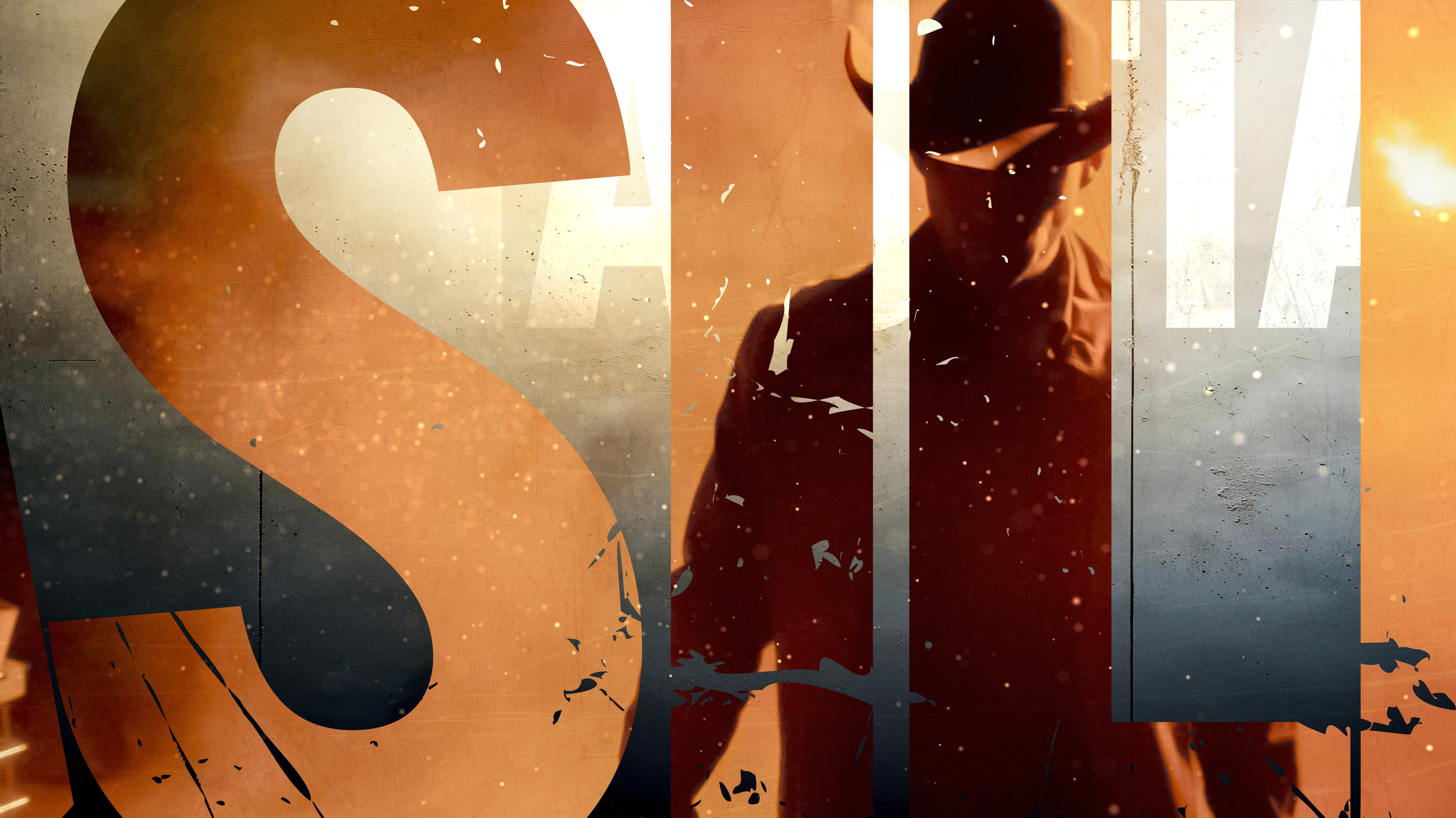
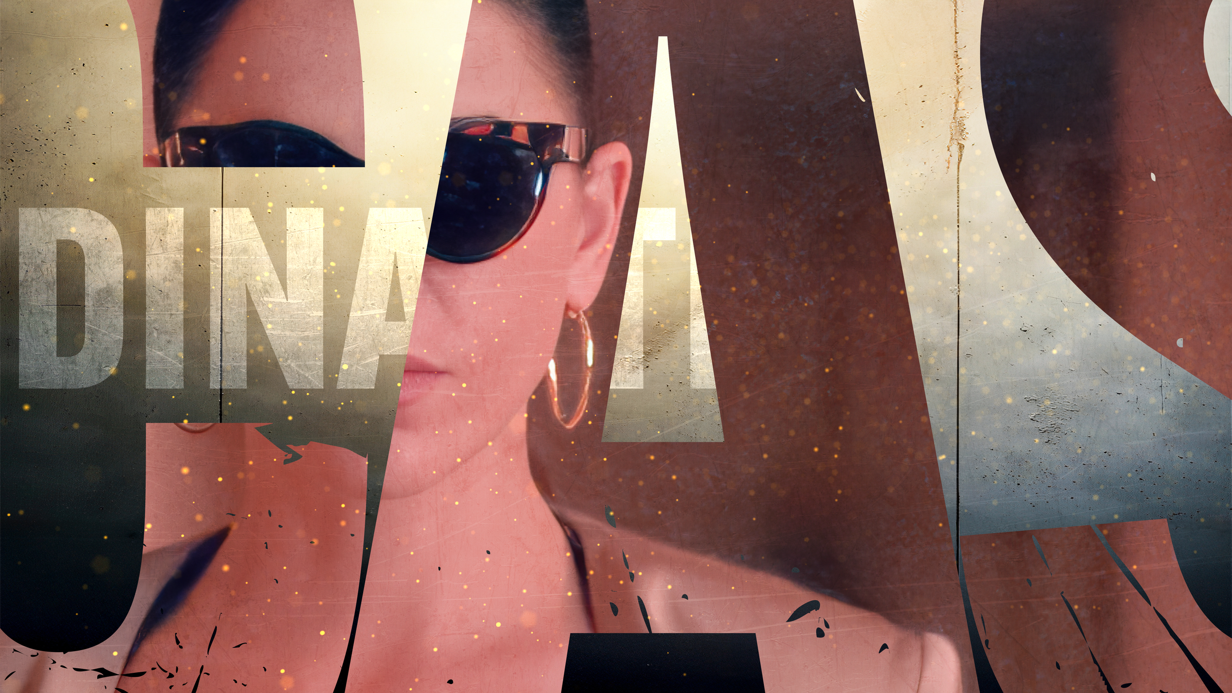
Typography was designed to feel heavy and authoritative, reflecting the permanence of the Casillas name. Strong letterforms, minimal ornamentation, and disciplined spacing reinforced hierarchy and control, while allowing the title to command attention without excess.
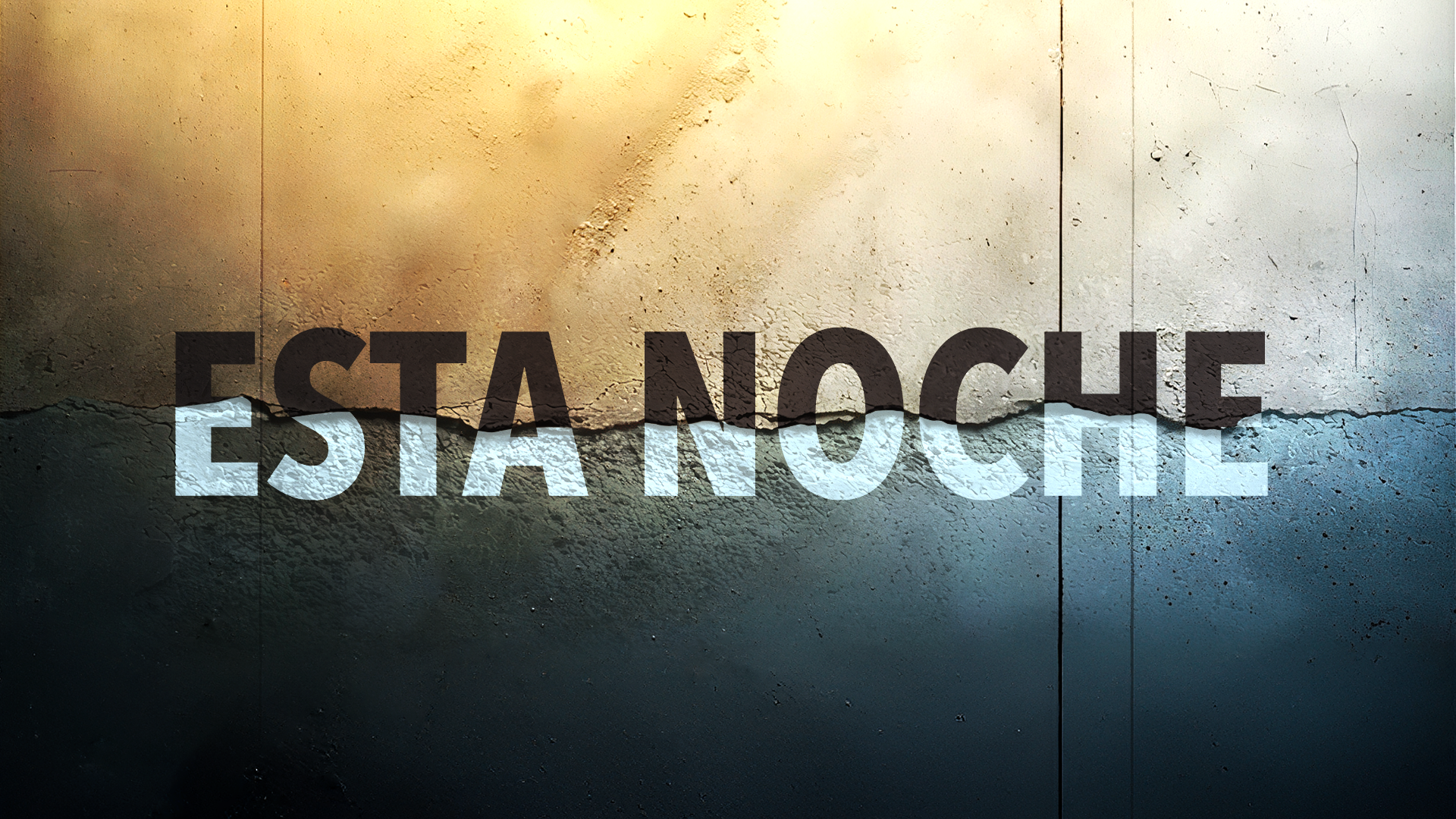
Motion was treated as a narrative tool rather than decoration. Transitions were intentional and paced to build tension, allowing silence, weight, and timing to do as much storytelling as movement itself.

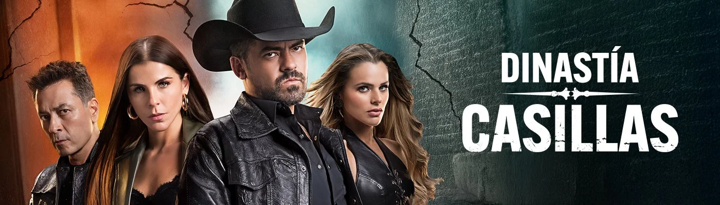
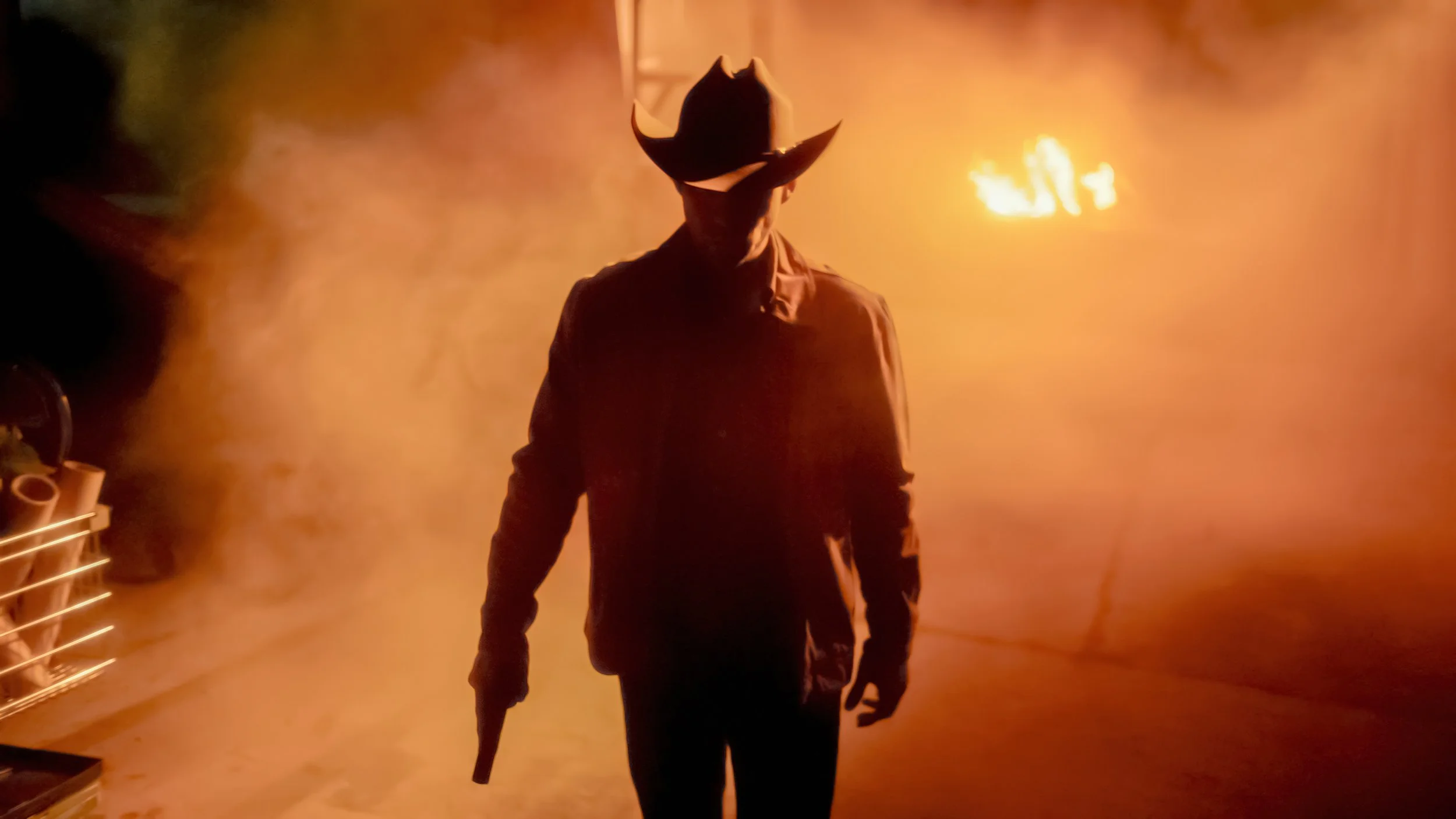
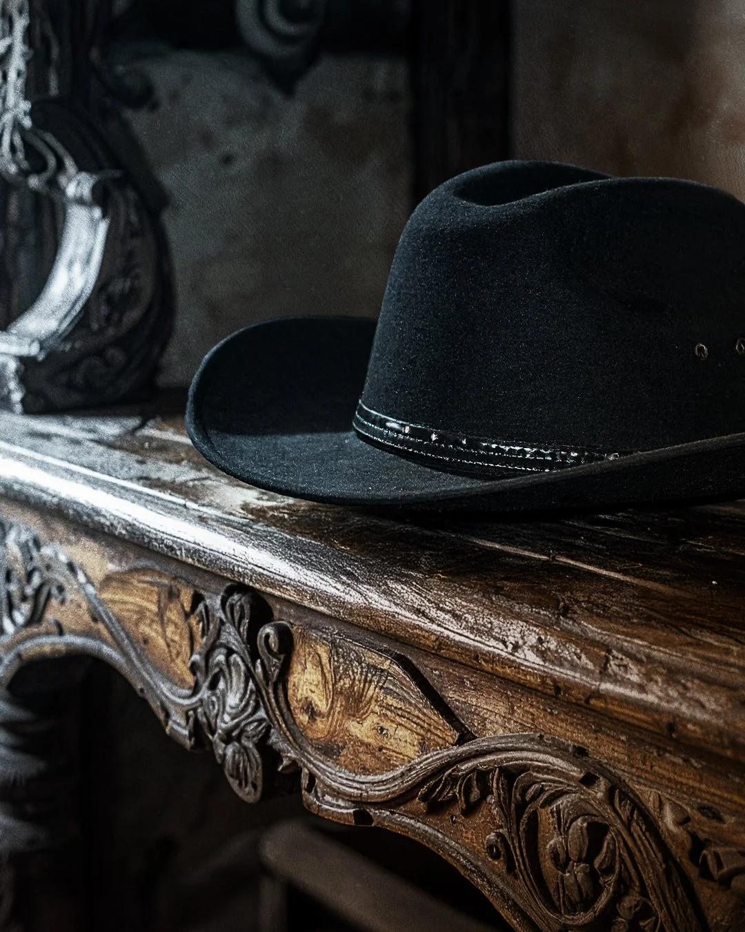
[ THE LOGO ]
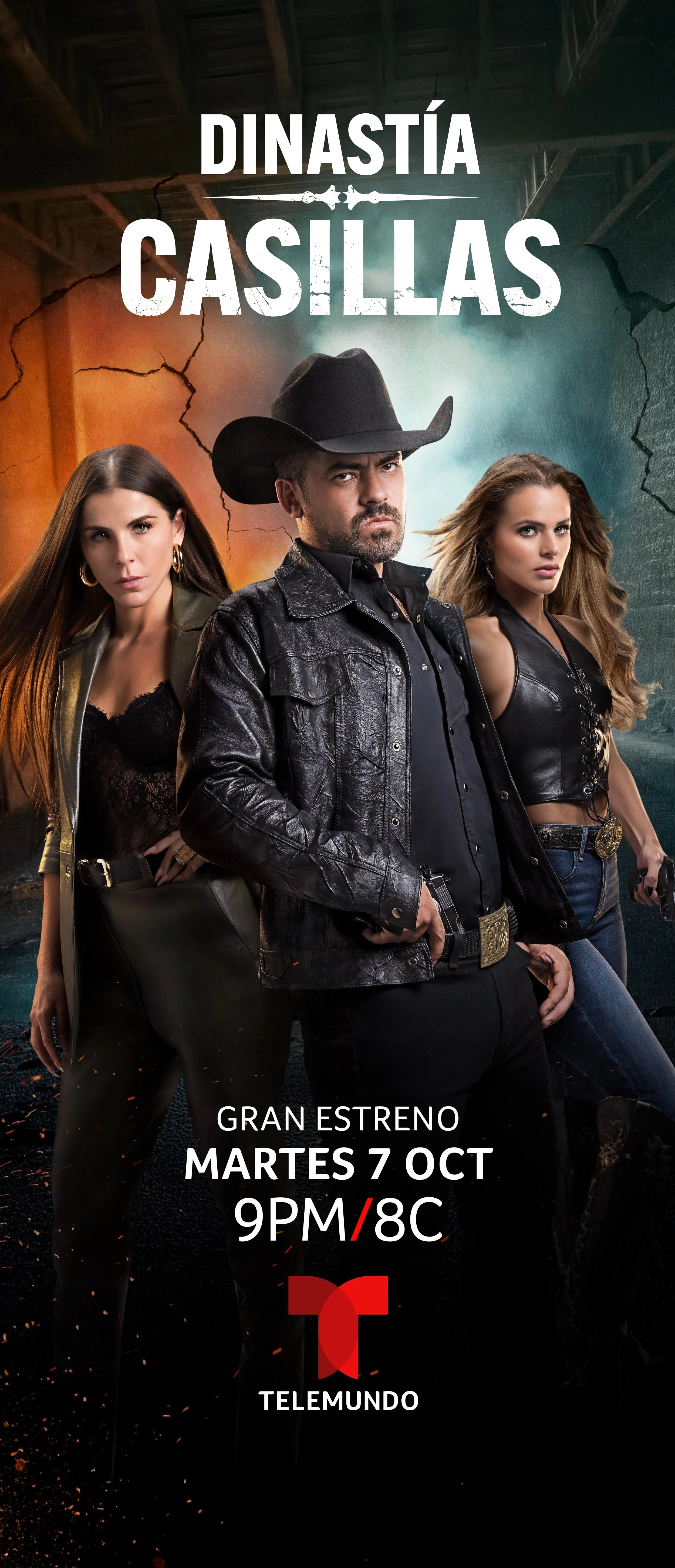
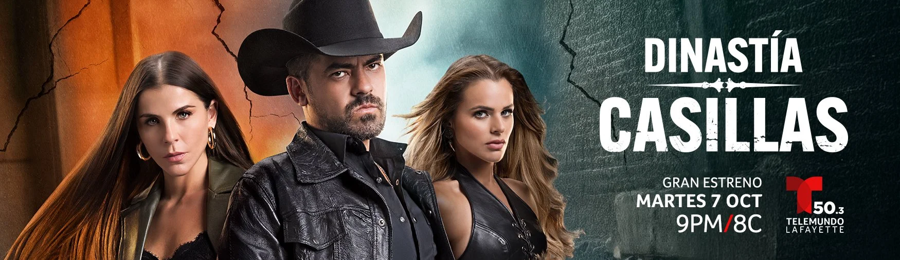
[ THE KEYART ]
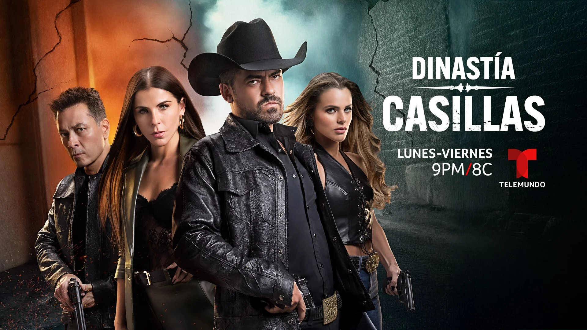
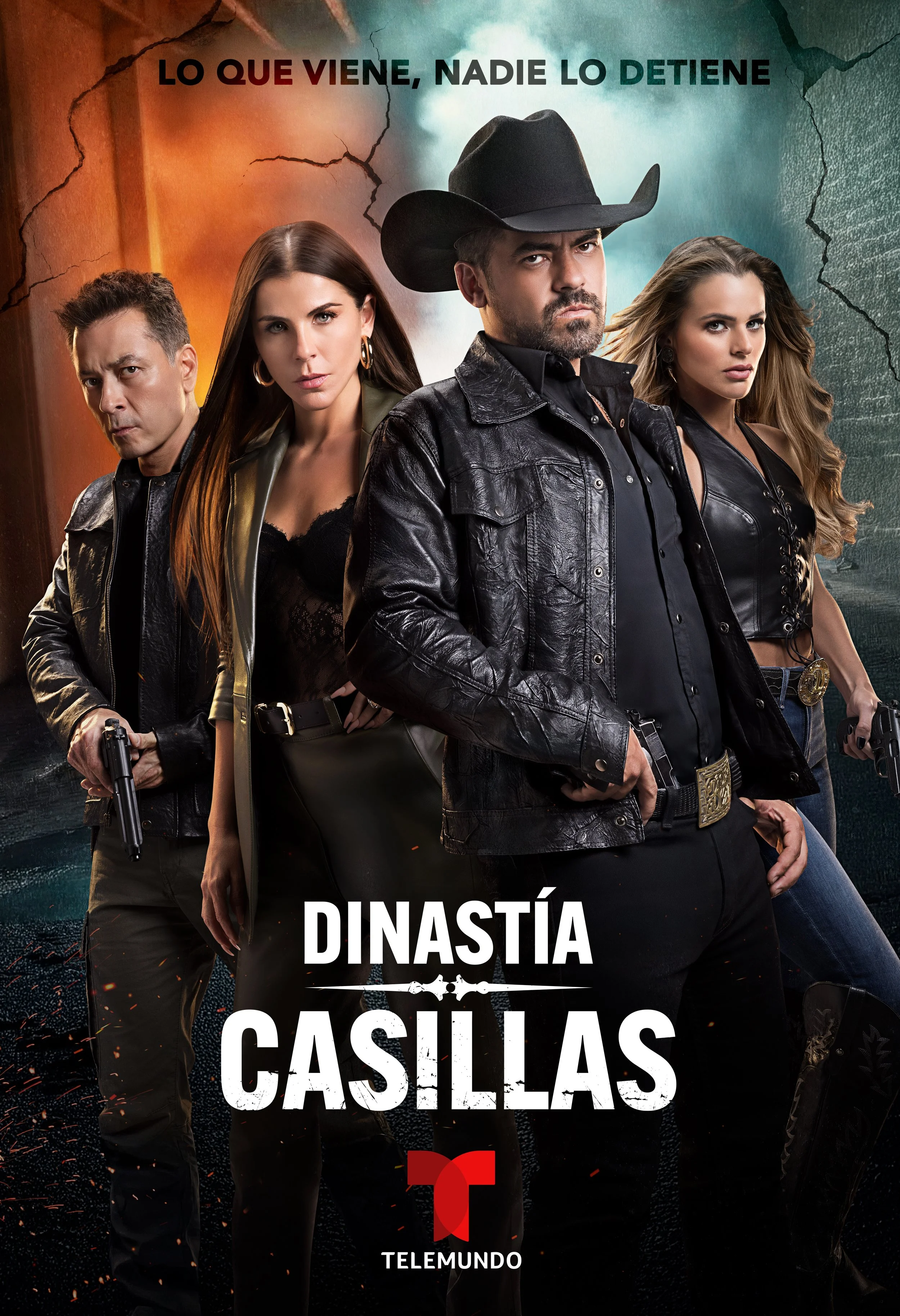
— BRAND IDENTITY SOLUTION —
A darker cinematic tone inspired by prestige crime dramas and modern serialized storytelling.
Designed to signal authority, aspiration, and high stakes at first glance.
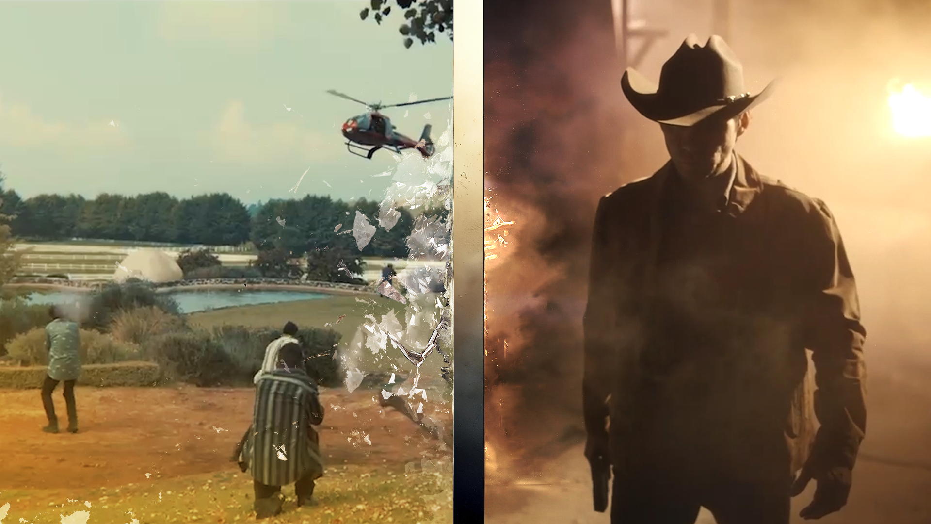
FROM TEASER TO FINAL
―
The work required balancing restraint and intensity, creating a system that could support episodic storytelling without losing narrative weight or tonal consistency.
[ THE PRMOTIONAL PACKAGE ]
Family intervention
—
The projects transitions were almost identical to my initial pitch. Fullscreen animations were also directly derived from my initial designs.
Pitched Designs

Delivered Final Designs
[ DIGITAL ]
Digital and promotional assets were built as modular systems to support episodic storytelling across the season. This approach allowed for flexibility and speed while maintaining a consistent visual language across multiple episodes and release windows.
Familiar Dance
[ RAPID CONCEPT EXPLORATION ]
—
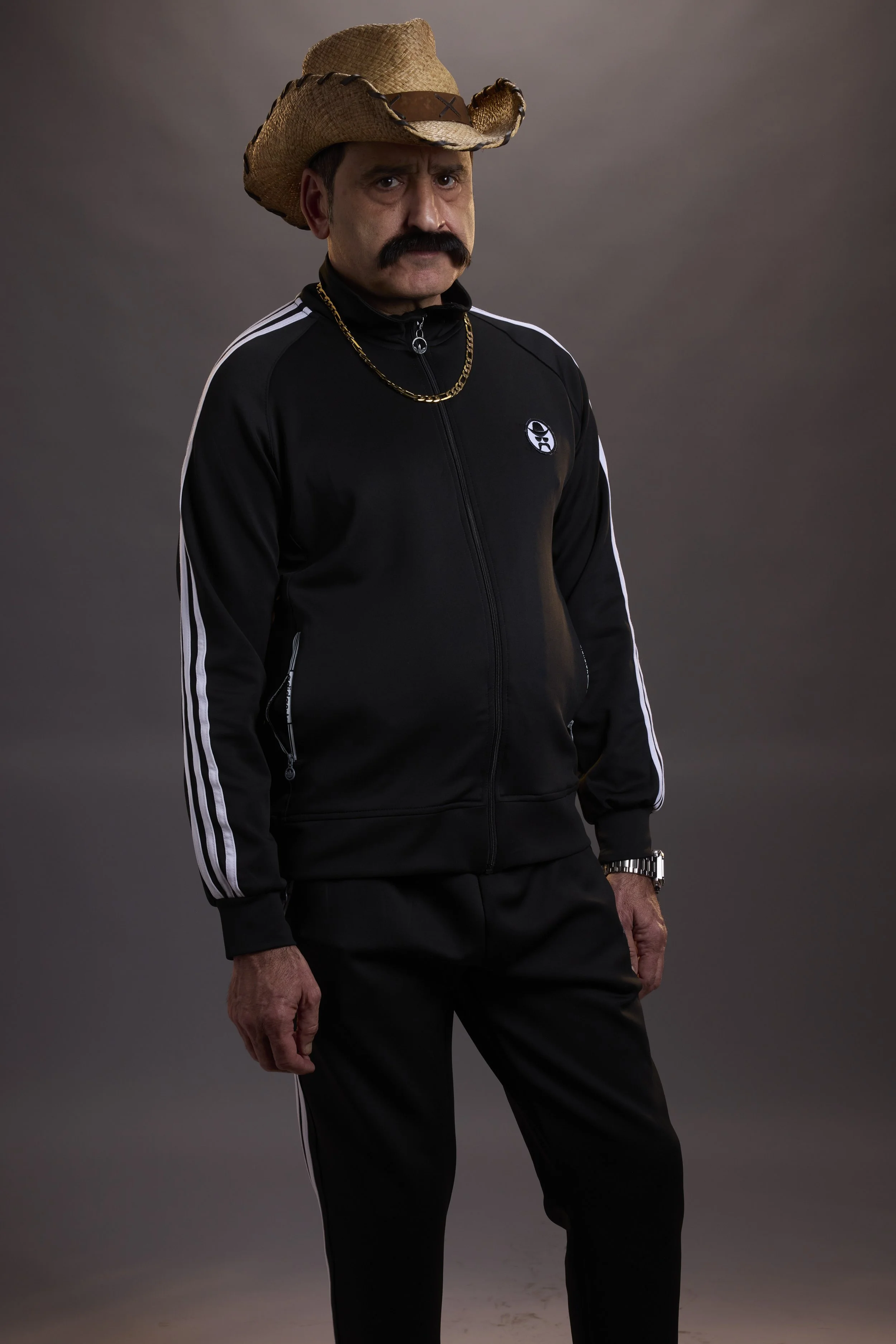
AI-assisted workflows were explored as a fast prototyping tool for experimental social content and audience engagement concepts. The goal was to quickly test character-driven promotional ideas that felt native to the tone and humor of the franchise while staying adaptable within tight production timelines.
INITIAL KEYART STILL —
Hand picking the Keyart is important as it could drastically shift the outcome results.
— RESULTS
Led AI-assisted concept development to rapidly explore character motion and environmental storytelling, offering a funny but narrative intent through it all.
End result is something that any and all fans of the show will say fits the character and bring a comedic allure to the property. As evident to all the comments and engagement fans loved the post.
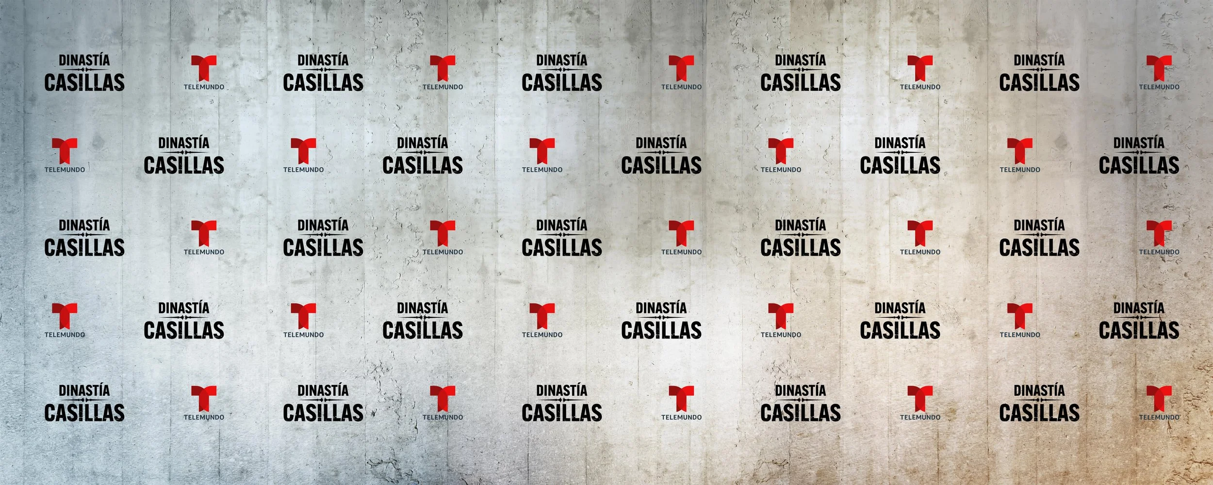
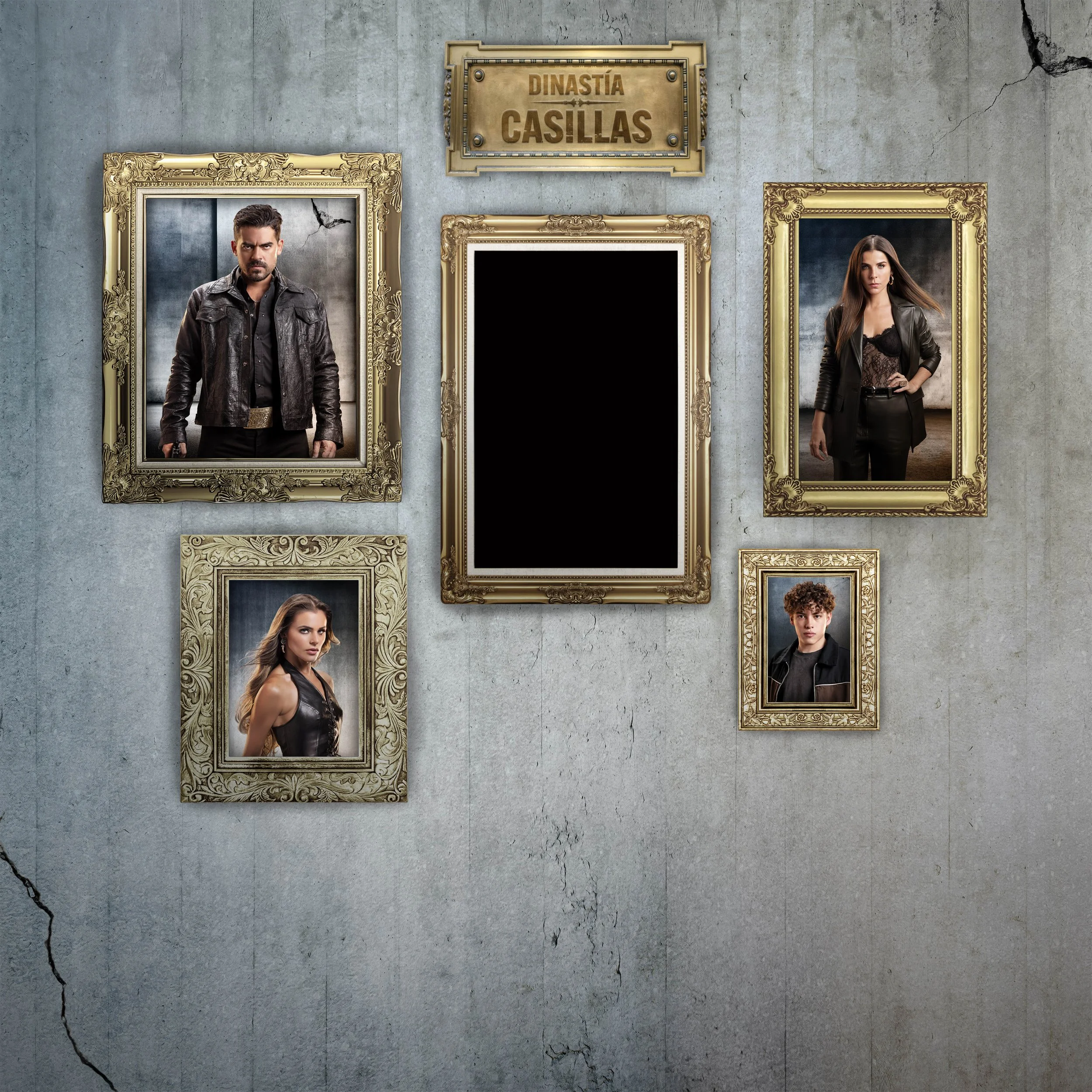
[ EXPERIENTIAL + OOH ]
— FAMILY PORTRAITS
Experiential and OOH executions were designed to invite audiences into the Casillas world, transforming brand presence into participatory moments.
An event display where people could take photos and have it set up like a family portrait so they can be a part of the Casillas “family”.
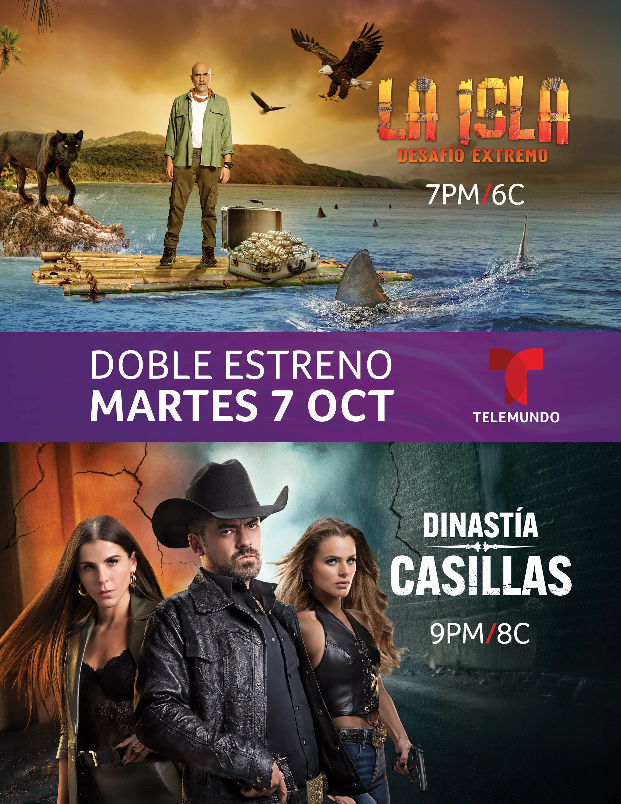
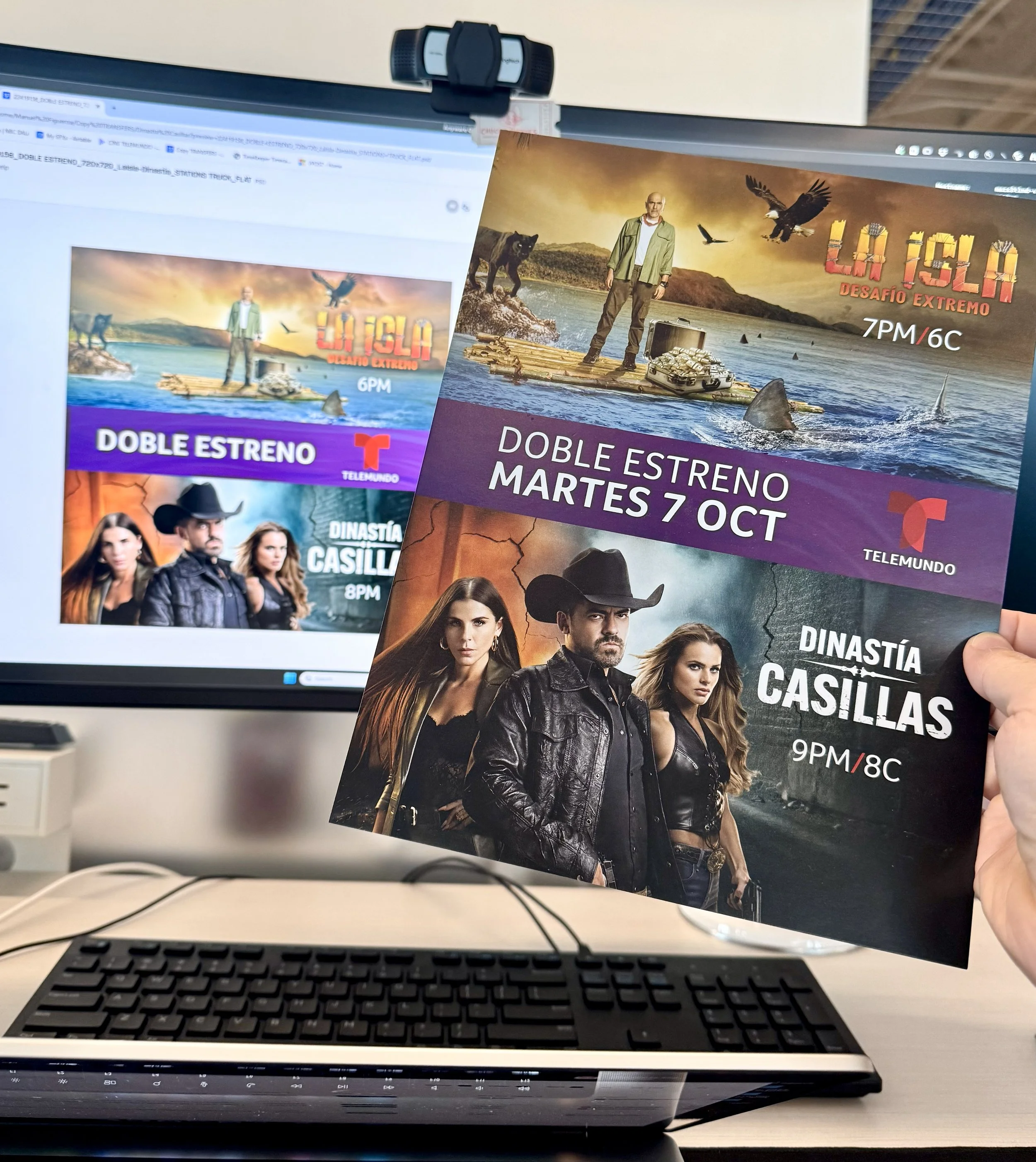
FRESH OFF THE PRESS —
Digital billboards, station trucks billboards and printed fliers for distribution digitally and in events.
Why It Worked
Established a darker, more cinematic visual identity aligned with themes of power and legacy
Reinforced narrative tension through restrained motion, typographic weight, and deliberate pacing
Scaled consistently across episodic broadcast and promotional executions
Balanced franchise continuity with creative evolution
Created a flexible system that supported long-form storytelling without diluting tone or authority
Enabled marketing teams to deploy consistent assets across weekly episode launches.