MISS UNIVERSE LATINA EL REALITY
BRANDING / MOTION GRAPHICS / VISUAL DESIGN / TOOLKITS / TEMPLATES
Brand Queen
Miss Universe Latina El Reality marked a bold evolution of the Miss Universe franchise, reimagining the traditional pageant format through the lens of competitive reality television. The creative challenge was to preserve the prestige and authority of the Miss Universe brand while introducing heightened drama, modern energy, and sustained visual impact across a long-form season.
I led the art direction and motion design from concept through execution, developing a refined visual system rooted in elegance, strength, and spectacle. Drawing inspiration from couture fashion, jewelry craftsmanship, and the physical crown itself, the identity balances timeless form with bold, contemporary accents. The resulting identity helped position the series as both a premium entertainment property and an ongoing competition, balancing glamour, tension, and clarity across broadcast and promotional campaigns.
DATE —
April - July 2025
ROLE —
Art Direction, Motion Graphics, Toolkits, Digital Templets
DELIVERABLES —
Design Decks, Logo Design, Motion Language, Social Toolkit, Promo Graphics, Sustaining Broadcast Elements, Event Assets.
CHANNELS —
Broadcast, Digital, OOH, Experiential, Promotional.
CONSTRAINTS —
Tight Timeline, Brand rules + Network Guidelines, Cross-Team Approvals.
OUTCOME —
Delivered on deadline for launch / premiere
Scaled across broadcast, digital, OOH, and live environments
Adopted across weekly episodes and promotional materials
Established a modern visual system for the Miss Universe Latina franchise
International / Spanish-first broadcast reach
Reinforced brand prestige while introducing competitive energy
Approved and implemented in collaboration with marketing and production teams
[ THE BIG IDEA ]
Reimagining the Miss Universe legacy as a modern, competitive reality experience that balances prestige, strength, and spectacle.
— OUT WITH THE OLD, IN WITH THE NEW —
Redefining how prestige translates into competition
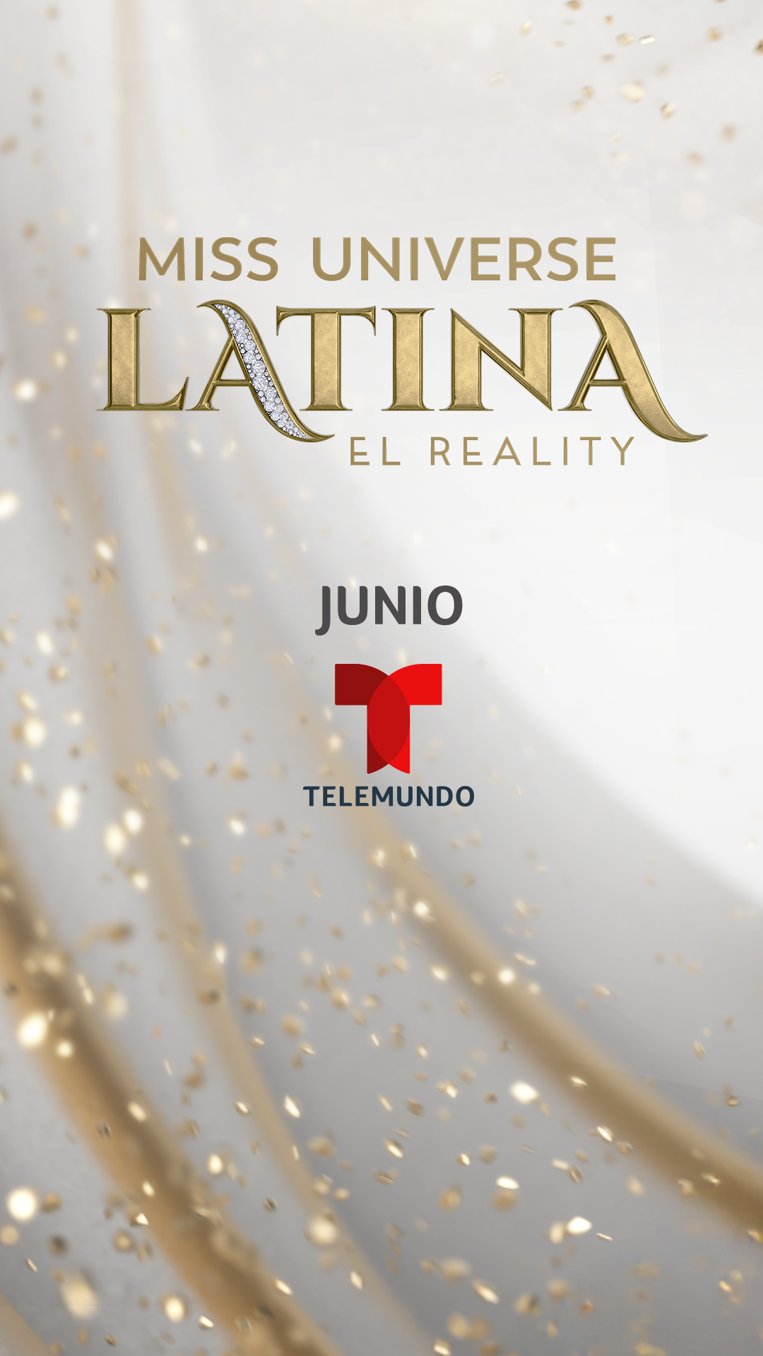
[ THE LOGO ]
New wardrobe, New logo
—
Countless logo concepts were explored and pitched, each using the familiar typeface as a foundation while experimenting with fresh visual directions. The process ultimately led to a final design that feels both iconic and elevated. Timeless in form, yet reimagined with diamond accents and a striking new look that commands attention, just like the contestants outfits.

―
[ THE KEYART ]
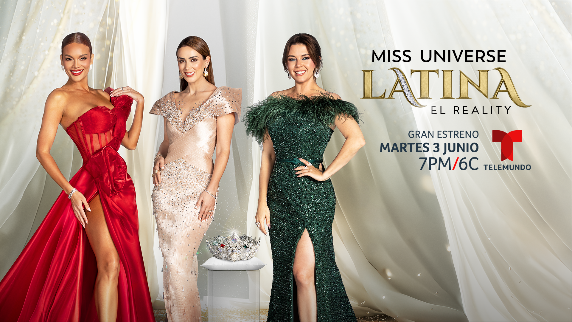
— BRAND IDENTITY SOLUTION —
Timeless form + bold accents commanding attention
Designed to signal authority, aspiration, and high stakes at first glance.

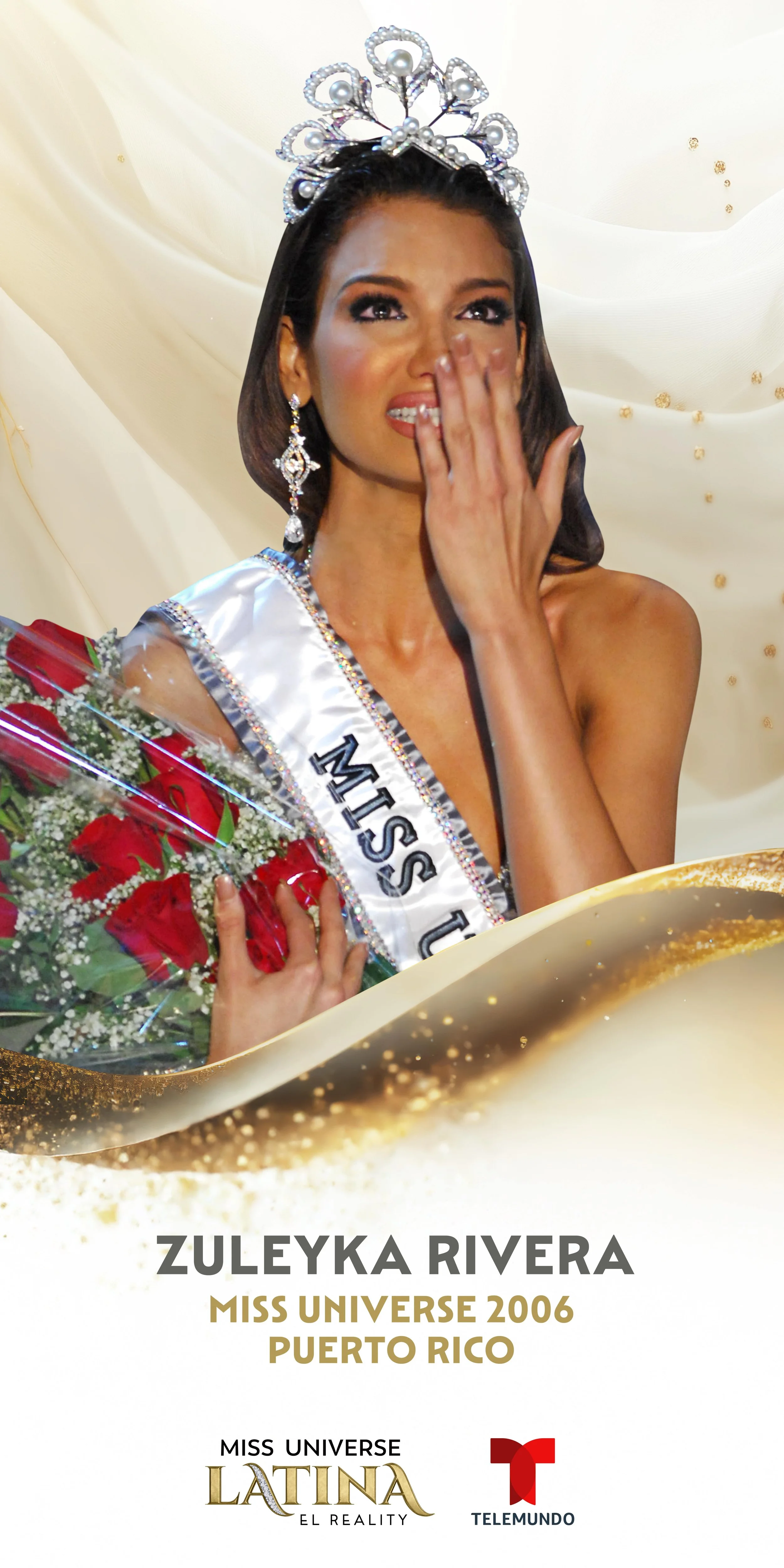
GLITZ & GLAM
―
While the unpredictable nature of reality TV is beyond our control, the visual direction was anything but uncertain - sharp and refined, like a diamond. Gold accents paired with soft, translucent silk backdrops created a distinctive aesthetic that exudes elegance and royalty, setting a luxurious tone throughout the show.


[ THE PROMO ]
The fight for the crown
—
Motion design emphasized weight, tension, and reveal, using slow-build transitions, metallic textures, and light-driven movement to reinforce the stakes of competition and the value of the crown itself.


[ DIGITAL ]
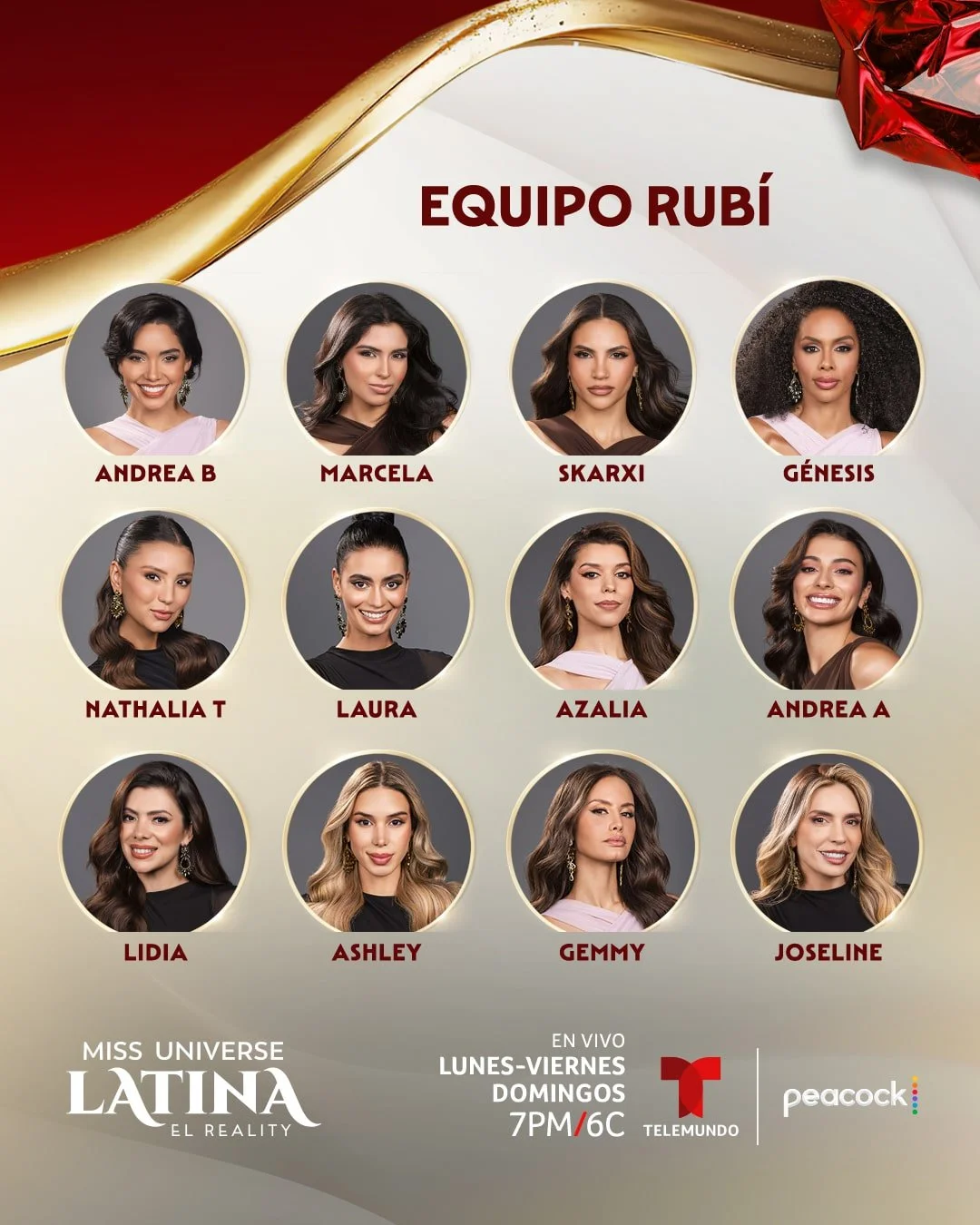
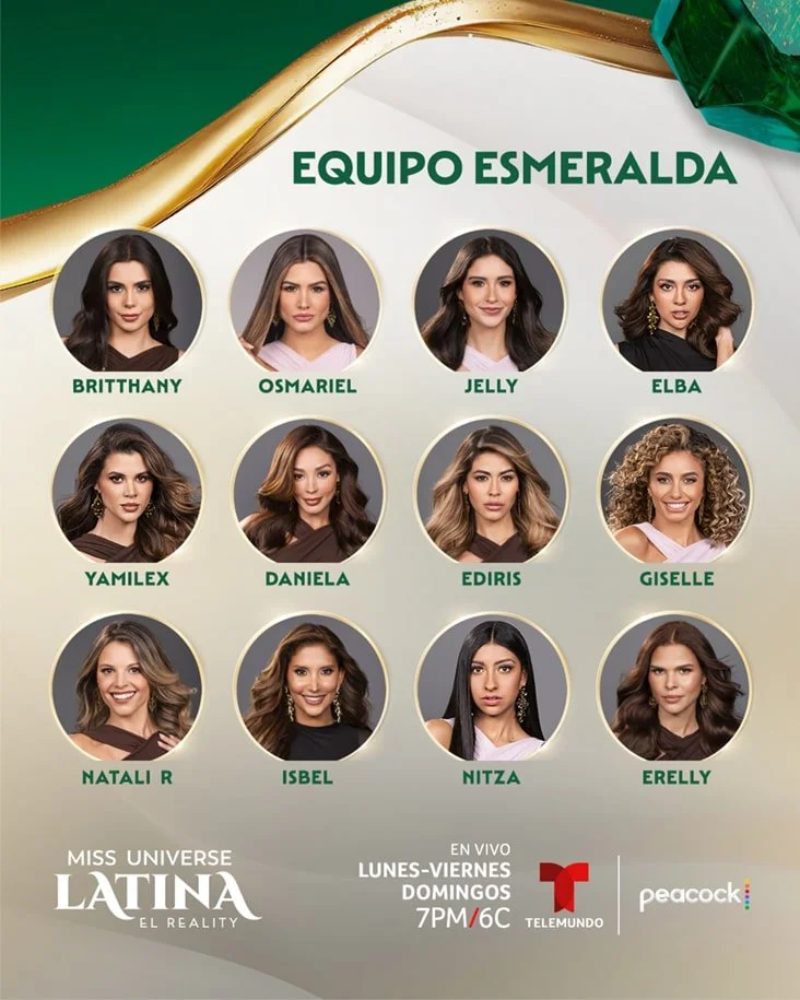
A robust social presence needed to keep audiences up to date and invested in the drama. Creating eye catching, easy to understand social posts were crucial.
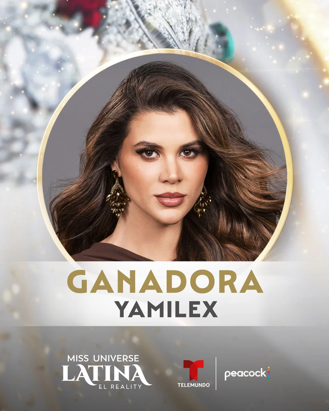
Social assets were designed to move quickly across platforms without sacrificing the visual authority of the brand.
As seen here.
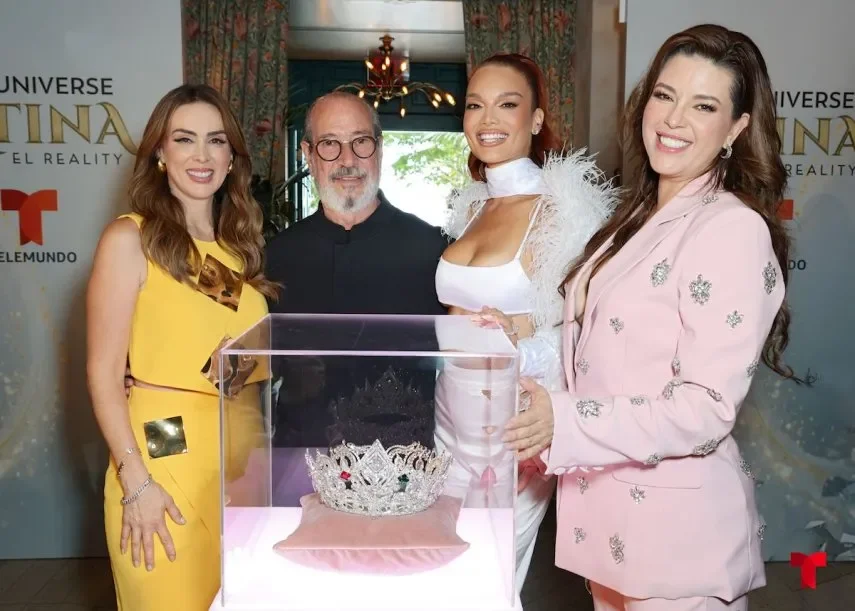
[ EXPERIENTIAL + OOH ]
Grounding the Brand in a Physical Icon —
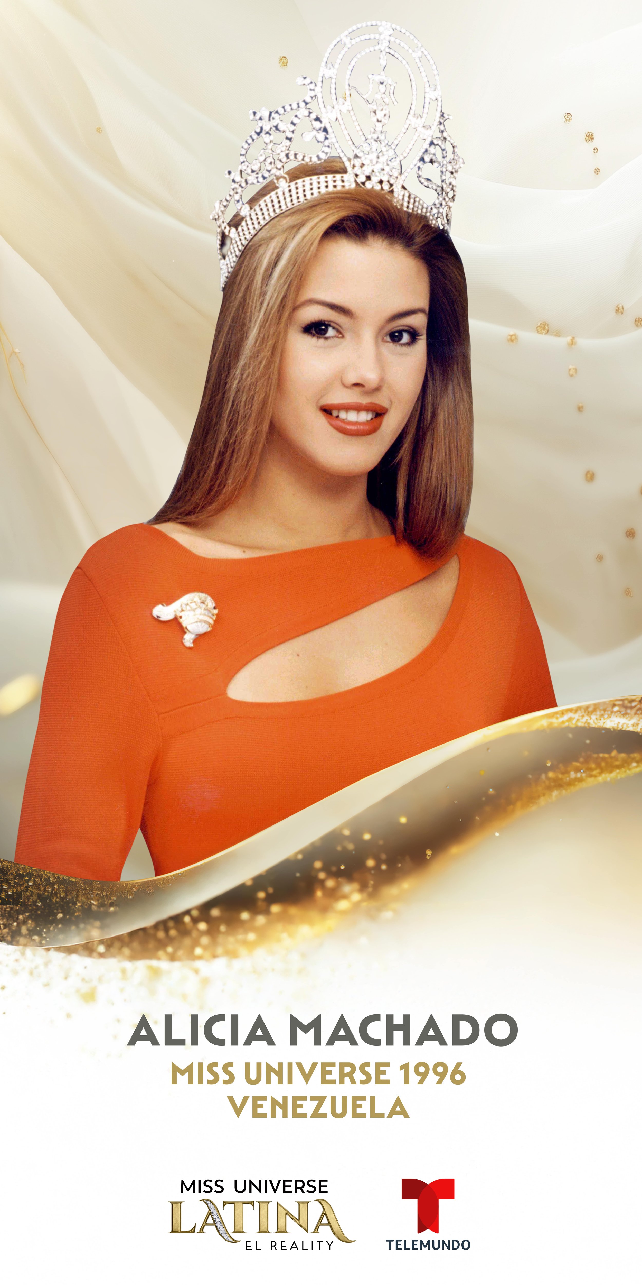
Access to the screen-used crown informed everything from lighting behavior to motion detailing and material treatment. Studying the physical object helped ground the visual identity in something tangible, allowing the system to feel aspirational without becoming artificial.

Why It Worked
Honored the legacy of the Miss Universe brand while evolving it into a bold, modern reality competition identity
Translated iconic franchise elements into a cohesive visual and motion language rooted in symbolism and material authenticity
Scaled seamlessly across broadcast, digital, out-of-home, and experiential environments through a unified design language
Balanced elegance and strength, allowing the brand to feel premium, contemporary, and emotionally resonant
Delivered a flexible system capable of supporting episodic storytelling while maintaining consistent brand recognition